Branding
2022 unfolded new rules for startups who chase raising investments.
Global stats showed us VC time spent reviewing pitch decks dropped by 24% compared to 2021. Converted to minutes – investors are ready to spend less than 3 minutes (2:42, on average) on your submitted pitch deck samples now.
We can almost hear the faint echo of Scooby-Doo’s “Ruh Roh!” from the startup scene.

But worry not. Renderforest knows the reliable formula for creating a winning pitch deck – even if you have only 2:42 minutes to present the whole thing.
In this thorough guide, we’ve collected everything you need to nail that pitch deck – from the ABCs to the actual examples of winning decks and templates.
We cover…
 |
 |
 |
Keep scrolling down for more!
Investor and serial entrepreneur Alejandro Cremades claims around 10 slides are enough for a winning investor pitch deck. Among these, the three most crucial slides that investors usually pay attention to are Financials, Team, and Competition – the core aspects that help them understand your startup’s potential for success.
This can be considered the raw ingredients of a successful pitch deck. However, your recipe might have different proportions and additives depending on the round of financing you’re raising, the sector you’re pitching in, the size of your business, and the current market trends.
Here’s how you should approach the process to find out what to include in the deck to match your specific needs.
Switch off your marketing hat and put on the investor one. Ask yourself: “What’s in it for them?“, “Would I be impressed with this idea as an investor?“
If you feel your initial pitch deck structure can leave investors on the fence, and if the hook is not strong enough, it’s time to rework the structure and add more relevant details that will make them feel invested.
There’s a formula that works in 99.9% of cases. It’s called being concise, relevant, and clear.
You should cut to the chase and transfer the most important information with a few words.
To recapitulate, find that hook, that point that will make investors believe in the potential of your startup and the necessity of your product. Then formulate it in the clearest way possible.
Here’s how AirBnB once did it.

As said before, the best pitch decks rotate around 10 slides. Usually, the must-haves include the following.

The business world considers these to be the key elements for a successful pitch deck, as by including them all, you cover the entire story of your startup. So, while you can modify your brand deck structure according to your needs, take advantage of everything crucial.
On top of that, feel free to restructure your order of slides if it helps you to make a better flow.
For example, if you’re raising money for a product already on the market, it might be better to start with your product and team info instead of the problem. On the contrary, if you’re pre-launch, it is better to start with the problem and focus on your product afterward, as investors need to understand why your solution is necessary and how you will solve the problem before they even learn what the solution is.
Because human brains are wired to process visuals faster than text, visuals are considered to be 50 times more memorable than textual content. So, your key figures and core messaging should be presented as infographics, charts, diagrams, and illustrations to capture the necessary attention.
We won’t go into much detail about styling pitch deck visuals here, as you already have a huge library of pitch deck templates by Renderforest already designed according to the best practices of corporate design.
Instead, here are some tips on which colors and fonts work best based on the most effective pitch deck examples.
White, gray, and blue are considered to be one of the most suitable color palettes for corporate-style presentations. Best pitch decks use these colors as a background and accentuate the key points with bright or dark accents, as these neutral tones are associated in human brains with reliability, trust, intelligence, balance and other positive features.
Scientists have found the highest correlation between Times New Roman and Helvetica fonts and the formal, legible perception of the text. And the font psychology says Sans Serif fonts such as Square, Humanist, Grotesque, Geometric and similar are very suitable for modern devices. These fonts associate with clean-looking, clear, and efficient content. Meanwhile, San Serif fonts’ letters require less space and are better displayed on desktop and mobile screens.
These rules are not set in stone, but the best pitch decks follow them, so it’s recommended to keep them in mind.
If you’re sitting in front of an empty slide trying to figure out how to structure your pitch deck, we suggest you close it and try a more efficient way.
Renderforest offers you a wide range of corporate-style pitch deck templates for any sector and purpose. If you can harness the power of pre-designed templates inspired by the best pitch decks, why not try?
Our introduction to the startup pitch deck article can help you to understand how Renderforest can assist you in creating a successful presentation tailored for a specific investor or accelerator.
You can also review other helpful resources like our Startup Pitch Deck Intro or another Pitch Deck Introduction.
Meanwhile, we share the ready-to-use templates below to create the best startup pitch decks with zero design or coding knowledge.
Just choose the template you like, customize it, and export it in one click from Renderforest to use it for any purpose.
 |
 |
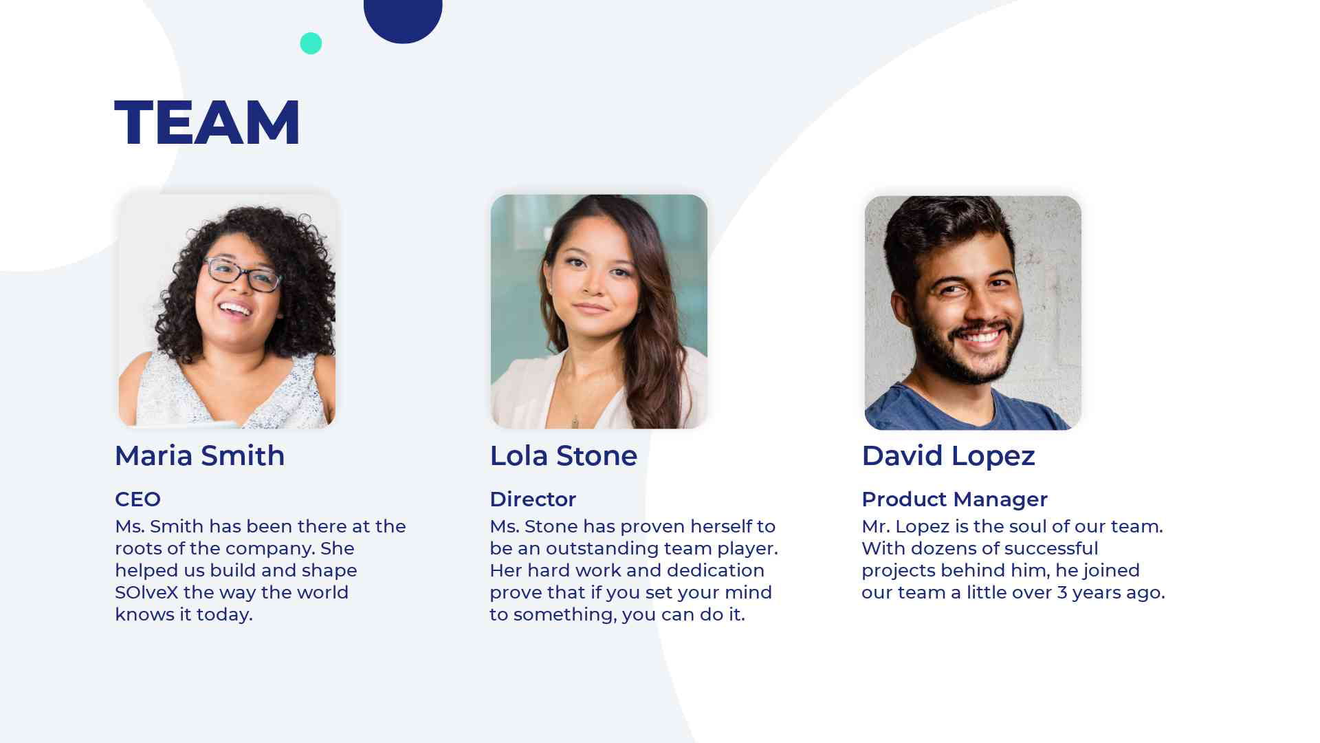 |
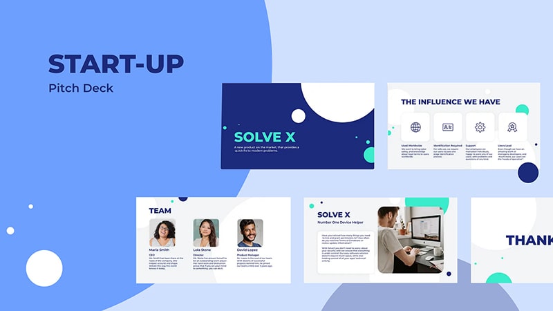
Here’s a classic version of the startup pitch template with a minimalistic design with a white background and turquoise-green accent. This pitch deck pack features 24 scenes you can filter to collect the needed slides.
The font color is dark blue – the ideal color for presentation titles and subtitles, as it is associated with intelligence and trust. Scenes include minimum visuals, yet the arrangement of elements and the font choice is completely eye-catching, leaving you enough space to focus on the content.
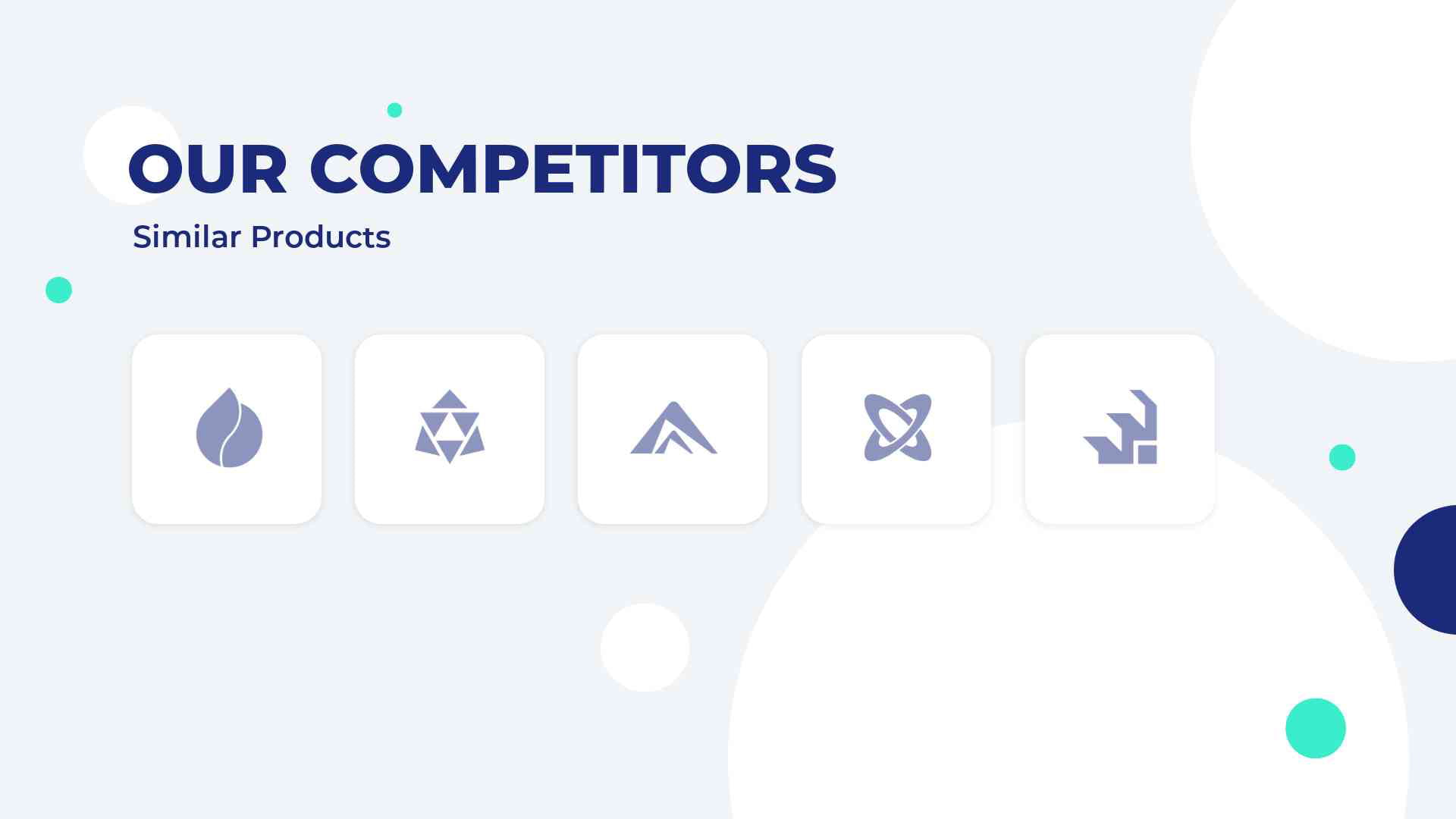
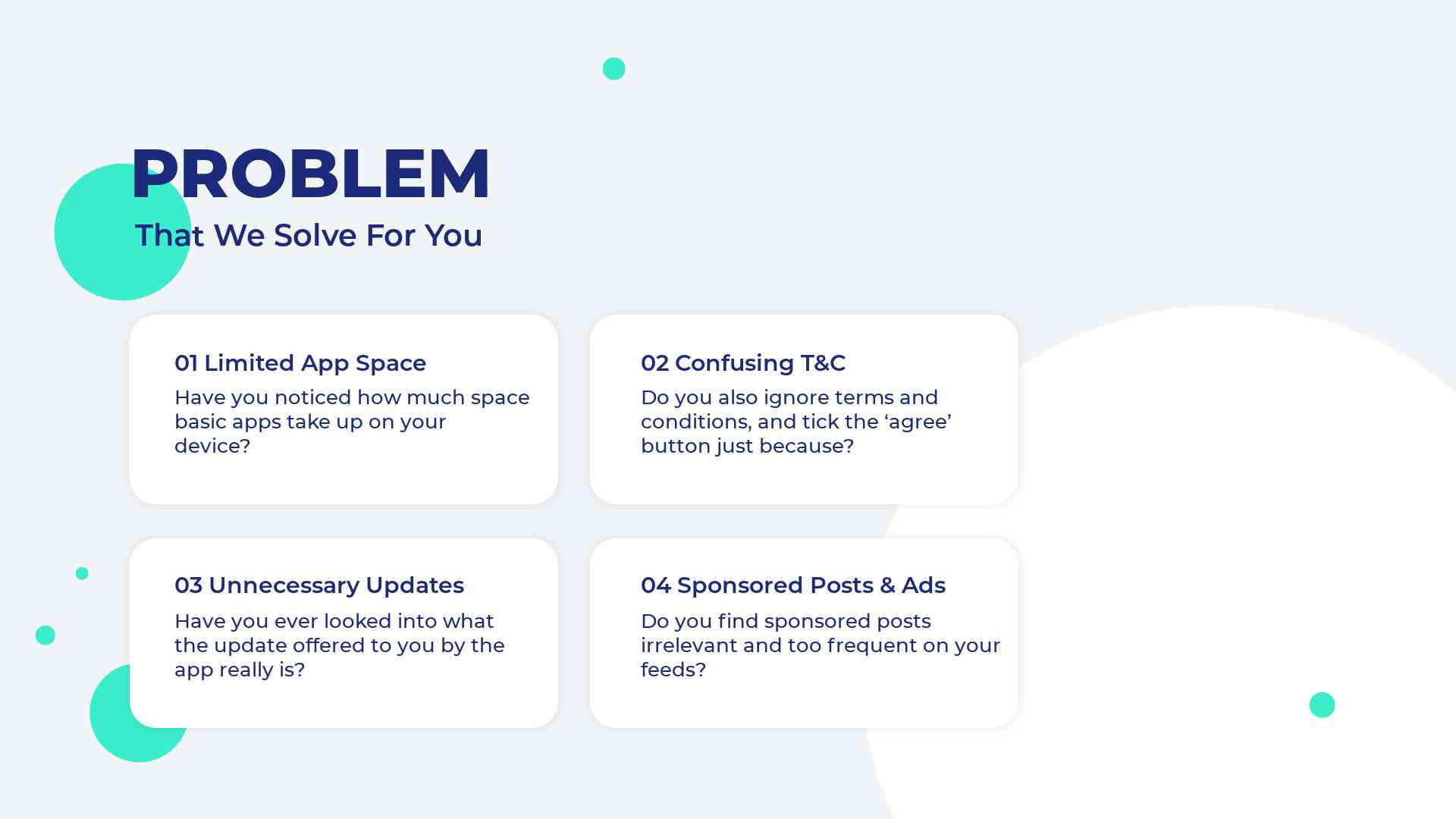
There are all standard pages that the best agency pitch decks are expected to have – competitor analysis, team, user feedback, service popularity with numbers, etc. So, this could be a great choice if you need to create a comprehensive yet classic and minimalistic presentation. You will have no shortage of slides to present your entire story. Meanwhile, slides are not visually heavy, so you can be sure the audience won’t get overwhelmed with information.
A minimalistic cover with dark blue background features the project title and a short description. If your company is established and has already made some noise, you can add the company logo here. If you need to showcase anything more, you can upload it on the cover – the overall formal impression will remain intact.
 |
 |
 |
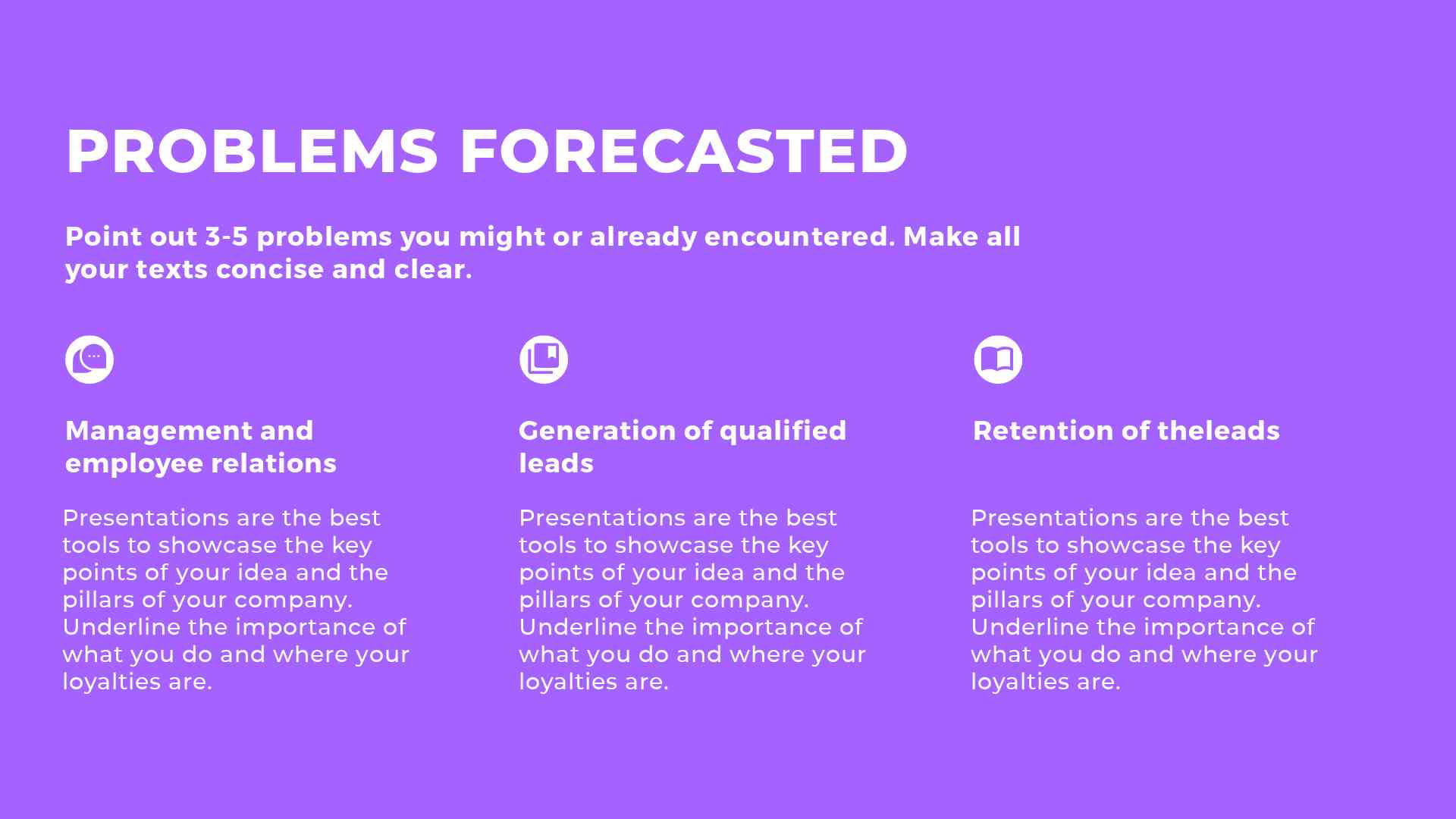
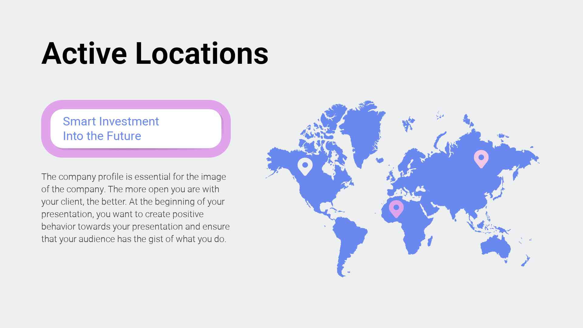
If you need a more customizable pitch deck template that gives you more creative opportunities, this is your best choice. This pitch deck corporate presentation includes 235 scenes (no typo, the number is real) for companies with a lot to share or those needing a huge pool of design ideas to mix elements until they come up with the best look.
This pitch template is more dynamic in terms of colors – white background, green and purple accents – a combination that works perfectly for creative industries. This color blend catches the eye and adds some playfulness to the formal corporate look.
The pack includes different styles of pitch deck examples to choose from. There are text-heavy slides, image-heavy pages, and more balanced, minimalistic designs that leave space to relax the eyes of the viewers.
As the best pitch decks are about the right balance between text and visuals, you’ll have plenty of choices here to create the perfect look for your presentation.
The cover is very minimalistic – plain white background and the company title. This simplicity can make an even bigger statement about your startup. Or, you could take a different approach and create an animated presentation using corporate video templates.
 |
 |
 |
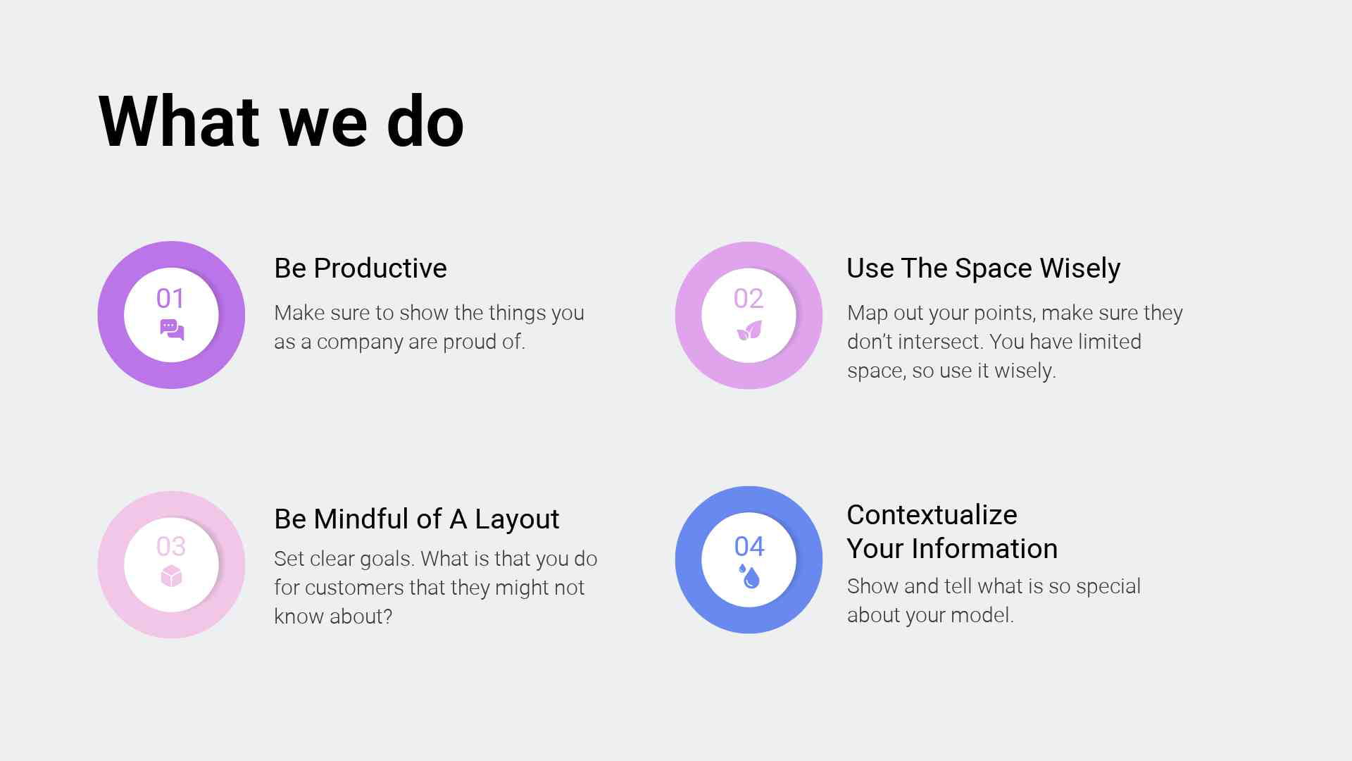
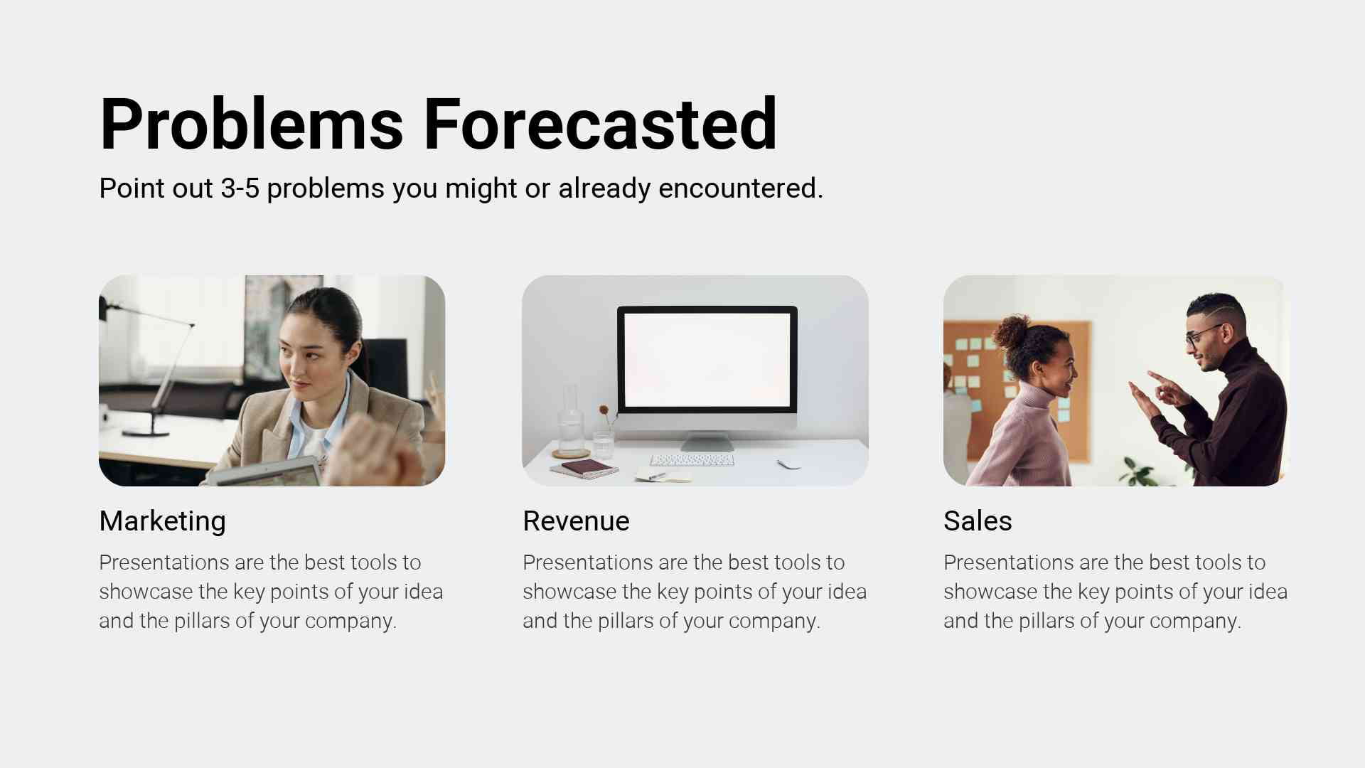
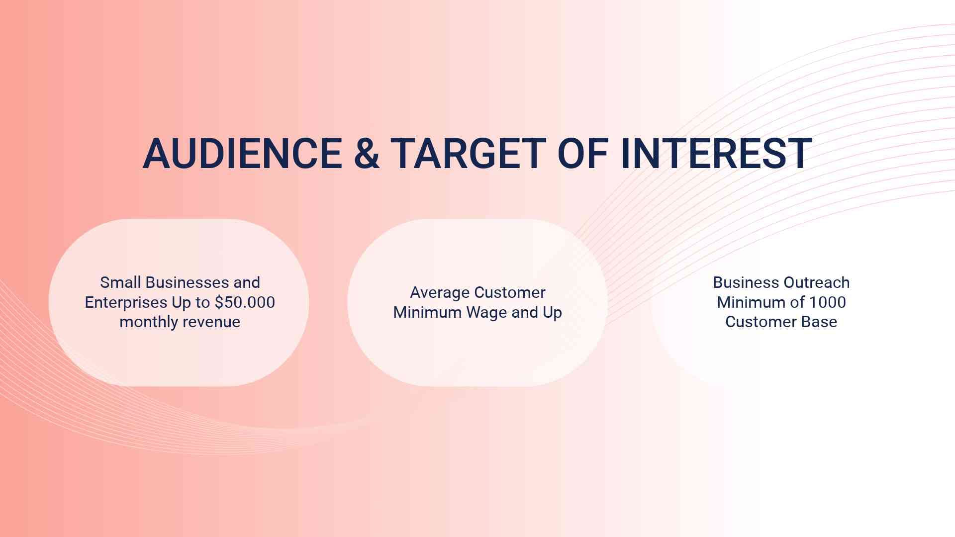
Need a more pastel-colored, creative investor pitch deck that features soft colors and is not afraid to have many team members’ photos? This professional pitch deck includes 120 scenes with a light pink and blue pastel color palette that works great for creative industries and startups.
Thanks to a milder design, this pitch deck template is attractive to the audience but still keeps the professionalism and trustworthiness of a corporate presentation. However, though the common rules of formal approach are kept, these brand decks will better suit companies in creative industries or services closer to consumer psychology.
Why? Because pink usually speaks about playfulness, nurturing, and romantic feelings, and these are hardly the feelings you want to evoke if your startup, let’s say, is in the AI industry. However, if you are in the fashion industry, for example, this pitch presentation will work perfectly!
120 scenes are more than enough to collect your desired pitch deck structure. And with the cover design options focusing on the startup’s team photos, you can emphasize the human side of the business and build trust among potential investors.
 |
 |
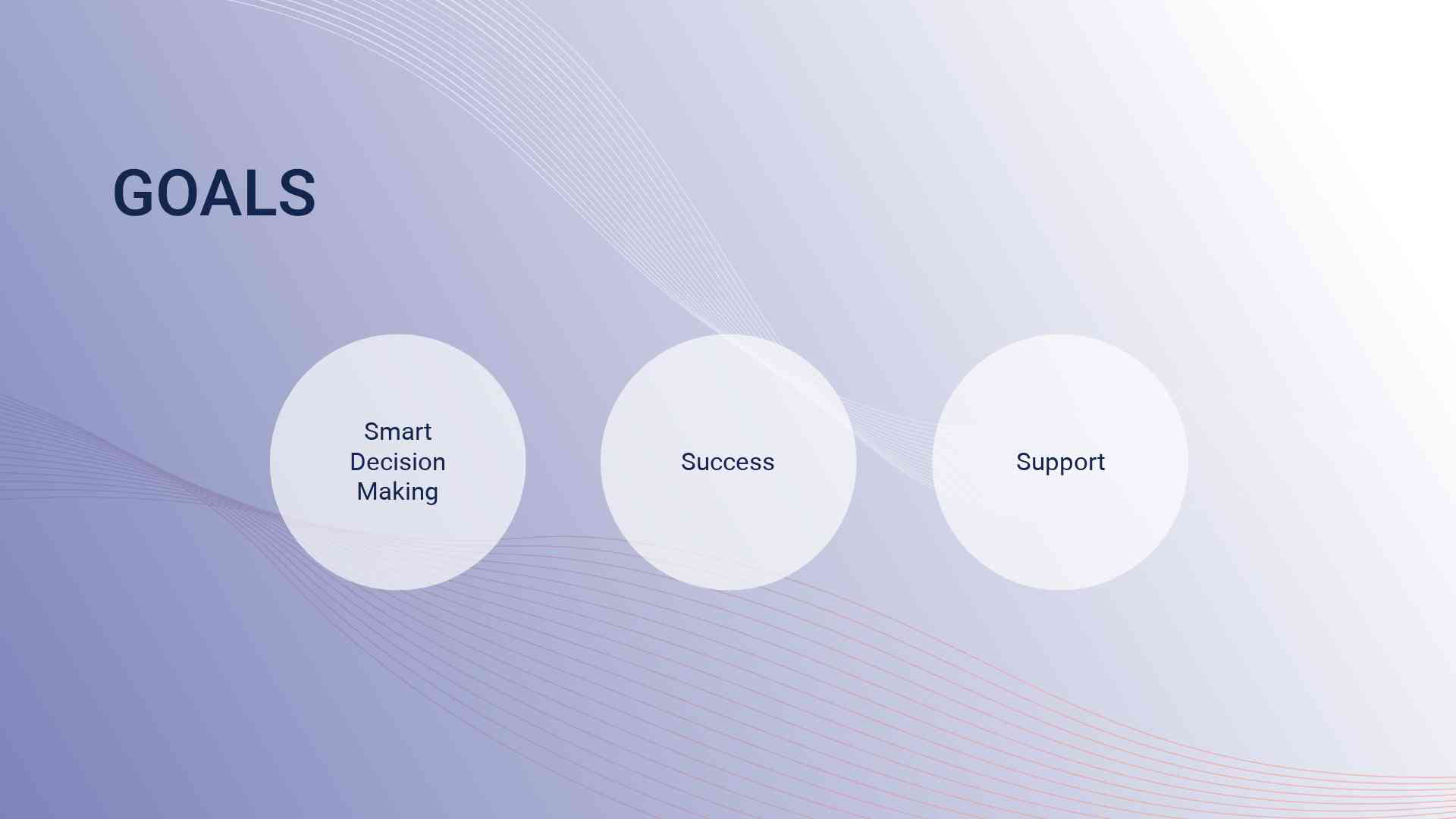 |
Closing the list of the best investor pitch decks from Renderforest with a business plan with a deck pack that features a gradient purple and peach color palette that softens the visual impression. That’s a basic pitch template – consisting of only 17 scenes and containing only the very necessary slides, such as vision, mission, goals, business plan, and questions.
Who can this brand deck be most useful for? It’s a great choice for those who don’t have so much content to share yet need a full-fledged presentation. Short but informative, this business plan is best used for sharing an idea with potential investors at the early stages of the product.
A potential drawback is the lack of slides with rich figures and data, as other pitch deck samples of this list have. However, if you’re still in the early stages of your project and still need to get all the data to share, this template can be your best choice.
What about delving deeper into the world of the best pitch decks?
We invite you to join us on the exhilarating journey of reviewing the most successful pitch decks! Our editorial team cherrypicked the most inspiring presentations of the worldly known companies (once startups like yours that managed to make a real success story) and learned how the best agency pitch decks are made.
Take this opportunity to observe, get inspired, and apply the knowledge to your business!

Back in 2004, when Facebook was not what it is today, the company owners had a crystal-clear understanding of their potential customers. Who are they? What’s their purchase power, and which part of their budget is reserved for the service? All these questions were answered in their pitch deck in great detail, awakening trust in the company’s success.
Additionally, Facebook had a clear action plan of what they were going to do and how. That’s one of the best pitch decks for a reason – it ensures the investors that their money isn’t going to be lost on a project without an action plan.

The first slide is a brilliant trigger for an investor pitch deck. Storage is a mess – at times, Dropbox was launching its solution, and this messy picture was relatable to almost everyone. The rest is even more convincing – as the company has a very detailed analysis of the current market situation – what consumers are looking for and what currently exists from the competitors’ side.
We especially loved how clearly Dropbox explains its features – no extra words to distract the attention, just a few points that make them stand out. That’s a great way to present your unique selling propositions and add more weight to the investors’ decision-making.

Did we already say Airbnb has one of the best pitch decks of all time? We want to state that again!
Showing 560M serviceable available market out of 2 billion + available total market is an undeniable statement of how great a potential Airbnb has. It also has an impressive competitor analysis – a creatively pictured visual graph with few words which clearly highlight the gaps Airbnb is going to fill.
And we loved the closing. Here they have a clear dialogue – we need a precisely estimated amount of money for specifically planned results.

The famous taxi company did a good trick. It looked at the market gaps and inconveniences from two sides – from the perspective of clients and drivers. That’s one of the best pitch decks that justifies the urgent need for the product from both sides.
What’s unique among the best pitch decks presented in this list so far is that Uber presented potential outcomes of their business plan – best-case scenario, realistic scenario, and worst-case one. That’s an inspiring way to demonstrate how well the team thinks through their idea and is ready for any possible outcome.
One of the best SaaS pitch decks – Buffer’s one is the closest to what we describe as a golden standard of modern-day presentations. It has 13 pages, is well structured, and contains only the key points needed to put the idea out there.
One of the best startup pitch decks – Buffer’s presentation- contains detailed milestones of what the company has achieved and intends to do next. This detailed timeline with dates and numbers helps to build trust in the team’s proficiency and the journey they have ahead.

Tinder wasn’t always called Tinder. When it started as a Match Box, the company made one of the best startup pitch decks, which is out of the ordinary in its structure and flow.
Instead of the standard problem-solution scheme (the effectiveness of which we do not underestimate), the company starts its brand deck with the story of Matt – a guy that’s a prototypical representative of Tinder’s target audience. He wants to talk to a girl at the party, but he’s shy – all the traits that this niche audience can easily relate to.

Well, WeWork is considered one of the best pitch decks due to its robust analytical and research data. It’s very detailed in its explanation of how it is going to change the office rental industry as a whole and what kind of services it will provide.
WeWork has done an excellent job of outlining the global market for co-working spaces and how it is set to grow exponentially. Just looking at this investor pitch deck is enough to realize this company knows what it’s doing. It also shows a detailed plan with costings and the 5-year projection.
Recommended Reading

The widely embraced social media phenomenon, TikTok, had its product developed in every detail when preparing this investor pitch deck. This allowed them to focus on the user experience and present a detailed explanation of how their product works and why it has the potential to become one of the most popular apps on the market.
Having screenshots of the final product with elaborate descriptions of the design and features is a winning play as it gives investors a taste of what the app offers and how it can be profitable.

The next on our list of the best pitch decks is BuzzFeed. What we loved about their investor pitch deck was the competitor analysis presented with the Venn diagram. This approach is a great way to compare the company’s product with similar products already on the market and show their intersecting points.
BuzzFeed also does a great job explaining its key differentiators and the development perspectives – where we are, where we are headed, and how big this can become. This cascading down from a big picture to the specifics is very helpful for investors to understand how this product can become profitable.
Lastly, they didn’t mention only founders or CEOs in the team slide as many others do. The list goes down to advisors, developers, designers, and editors, which, in our view, shows a more human-centered approach that is very inviting.

We are in love with the initial statement on Moz’s pitch template’s cover. This brief sentence conveys a wealth of information about the company’s previous journey and where it’s heading now + it adds much confidence to the team and their project.
Further, they did a great mix of storytelling and a truly deep analysis of their industry, competitors, and the existing market. We especially liked the detailed breakdown of Moz’s target market and its distribution.
And the unique point – Moz presents potential acquisitions that could take place in the future as part of their roadmap.

What a brilliant problem slide – LinkedIn lists three popular ways of professional people search at the moment and how they are inefficient. Further, they nailed it by presenting LinkedIn as a Professional People Search 2.0, comparing it to the successful companies of other fields that transformed how things worked before.
These parallels are drawn throughout the whole pitch deck that makes its main point clear: LinkedIn will be the next generation of professional people search focused on user-based networks, a model that is already proven to work in the examples of Google, eBay, and Paypal.
We also loved how detailed and structured LinkedIn presents its superiority over its competitors. No loud words – just realistic calculations and comparisons showing their leading position creates high barriers to entry for the competition.

Here you can see one of the most concise pitch decks where the team is super laconic in presenting their project. The winning maneuver here is tying the first part of the brand deck to Bitcoin – a global currency, the popularity of which is growing exponentially.
Further, the company merges the Bitcoin potential and its product by presenting Coinbase as the easy-to-use Bitcoin wallet compared to all other complex solutions existing in the market.
And the cherry on top? It draws a parallel between the connection of Coinbase and Bitcoin and iTunes and MP3 to create associations of success and reliability.

We give the awards for the “most detailed and clear explanation of the product” to Foursquare. This is one of the best startup pitch decks if your startup is at the beginning of its journey and has just released the product’s first version.
If you are at your starting point, this type of detailed brand deck can help you fully reveal the whole idea of the company. We recommend you take their writing style and the construction of the slides if there is a need to present your idea from scratch, and the lack of details can work against you.

More a user-centered presentation of how the product can be used rather than a pitch deck for investors, Snapchat’s presentation anyways finds its place in our list of best pitch decks. Why? Because they are mastering the art of product demonstration – you feel like you are about to use the product already when you see their slides.
What’s the secret behind it? Very personal and honest style of sharing information + the team behind Snapchat developed a great philosophy before they launched the product – embracing the moment and unguarded conversations.
Well, YouTube’s early-stage presentation is not as visually appealing and modern-looking as others in our best pitch decks list. But we want you to look at it from another perspective – how with just an idea and a few slides, the YouTube team managed to convey their vision of how the product will look at its full capacity.
Here, the emphasis is mostly on the genius idea behind the startup – videos exist as isolated files, and something should be done with that. The team behind YouTube managed to find the right pain point that triggered many in the gradually growing digital era. And if your idea is worthy, it can win over investors even without an outstanding presentation. Just a clear presentation of a great idea.

Well, here’s another great example of mixing creative and analytical approaches – the Crunchbase pitch deck. They perfectly promote their value as a private company prospecting space with a hook – the public company market is shrinking, while private companies are the way to go. Meanwhile, many professionals strive to get opportunities in the private market. Added the thoughtfully picked visuals of ice fissure – and the viewers fall into the feeling of the cold inaccessible world of private companies where they need help.
It’s also worth mentioning Crunchbase is the first in our list of best pitch decks of all time that presents a growth engine. It’s a great way to demonstrate the effectiveness of your project and show investors how it can reach its full potential.

Here’s something new we haven’t talked about before. Peloton has one of the best investor pitch decks due to the detailed brand wheel on which they built their whole presentation.
The brand wheel is a clear graph showing the core four aspects necessary for investors to understand the whole idea of the product and how it fits into the market. In more simple terms, the brand wheel shows the brand-customer relationship from many angles – from what the startup team tries to convey to how it’s perceived by their customers.
We liked the brand strategy Peloton has – they have very detailed demographics and psychographics of their target audience. Consequently, they know which messaging and visuals are the most suitable for their potential customers.

The pitch deck of Wayfair awakes emotions of comfy home life, as the colors and visuals bring a feeling of warmth and coziness to the viewer. That’s this investor pitch deck’s first success as Wayfair transforms how people shop for home furnishings and decor. So, if their presentation design alone can set the right emotional background, their desired impression is half made.
What further caught our attention were the detailed financials. Reconciliation of adjusted EBITDA, free cash flow, and illustrative customer acquisition cost – all of these elements are a great way to demonstrate how the company is developing and growing in the language of numbers that investors understand the best.

Another one of the best startup pitch decks – Walmart shows the effectiveness of their investment in Flipkart Group. This eCommerce company can open new doors into an online market for Walmart.
This presentation demonstrates the effectiveness of the synergy between the two companies – Walmart brings its offline network and expertise. At the same time, Flipkart Group provides an online presence and knowledge of the market.
Slide 7 is a good way to present your startup’s growth opportunity in a specific market. You can see Walmart included all the key metrics that comprehensively overview current and future opportunities. It’s a good example of deep analytical data that shows the growth rate in the market, added detailed data about potential customers and their characteristics.

Coming to Bliss, here’s one of the pitch decks with a great approach to justifying why they need the finance they need and why investors should pay attention now and not later.
Their financing slide is a good example of giving investors the WHY behind their investment. Here, Bliss provides precise data on when they can reach certain milestones and how their decisions will affect the company’s future. Isn’t it more impressive than just showing the number of cash they need?
We also love Bliss creating urgency by emphasizing engineering talent’s poor adaptability to the increasingly remote world. They provide investors with a clear understanding of how their investment can help them to bridge the gap between current and future states.

Best pitch decks can break the rules of standard structures, and Launchrock’s example is great proof of it.
There is no standard problem/solution slide that explains the pain point and how the product solves it. Instead, Launchrock used an unconventional approach – they just listed their key achievements so far (users, shares, etc.) and some examples of how customers use them.
Actually, it’s not about the standard structure that matters but the effectiveness of presenting your value and how it can be used. Launchrock was a successful example of this approach – they showed what they did and how it worked.
This investor pitch deck is wrapped up by a large team of investors and advisors – a great way to show the engagement of people who believe in your idea.

In contrast to the previous brand deck, Intercom’s presentation is a very standard one. That’s one of the best pitch decks that helped them raise funding for further development. Though you may find the content too plain and simple – that’s what made it effective.
The startup team tried to avoid overwhelming investors with complex information. You can see only the most critical information without further details or explanations.
What we loved a lot (and that’s not the first time it proved effective), they included very detailed expectations from investors in the presentation. There is a clear amount of money needed, a timeline, and even special conditions if the company can meet its own goals.

It seems it’s the first investor pitch deck that includes a success story of an existing client who already benefits from their product. DODOCASE’s use case illustration reveals Shopify’s value and effectiveness without any further explanations from the startup team. And what was a smart move, in our opinion, is that Shopify showed the gradual success of their client when they first Shopify’s standard version and then moved to Shopify Premium, boosting their results even further.
That’s a good trick to show well-structured subscription models and which benefits each user level gets.
What else? We also loved growth vectors, a specific way to demonstrate the key directions for the company’s development in terms of products and markets.
Key Points

Oh, how much we love clearly formulated slogans. Mattermark presents itself like a Google for business people, and that first-slide-first-impression vibe is hard to forget. Further, they show how Google addresses business people’s needs regarding information about investments, partners, and competitors, emphasizing the gaps in the market. That’s a good way to present a problem your startup is trying to solve.
This brand deck contains robust graphs and charts – something that shows the deep financial expertise of the team. The company’s previous performance and future development plans are illustrated with the help of very informative visuals.

Another nonconformist pitch deck example – no financials to demonstrate the company’s performance, no case studies, and no detailed problem statements.
Instead, Biogrify made a nice presentation with real examples of how the product looks and works in different scenarios. You can get the first impression of the product and how it works without a single word – just an example of posts shared on their social network.
We liked the colors and the creative examples of the platform, which were picked carefully to show the universal nature of the product. Overall, a great way to hook investors in the first slides – even without many statements about the potential of your startup.

Did we say short and concise? Piccsy heard that. This investor presentation has only four slides with the most straightforward structure.
First, what’s the problem? The problem slide is very comprehensive. A detailed bubble chart shows all the possible directions where the Piccsy team can move, and the simple pictorial illustration of each direction makes understanding easy. This slide shows the team’s clear vision and understanding of the market they are entering.
What’s coming next? Solution! That’s not as robust as the problem slide, but quite impressive in its way. There is a straightforward intro of the main directions where this social network can help users stream their desired content.
The last slide is about the team behind Piccsy. Short. Quick. That’s all you need to know.
Well, it would be honest to say that presentations this short are not the best idea for early-stage startups. And don’t forget about the +- 10 pages standard that prevails among investor pitch decks.
Still, that’s one of the best pitch decks in history, thanks to its straightforward language and the ability to say more with less.
Fyre comes with a big announcement. Their pitch deck promotes and announces the Fyre Festival along with product marketing, showcasing how deep the company’s roots are with music and influencers and the community-driven approach they had from the very beginning.
The style of the presentation deserves special attention. The slides are very minimalistic and with all the elements of high-class aesthetics. They perfectly translate the niche where Fyre positions itself – confident, stylish, and up-to-date.
And Fyre’s community of the most renowned artists of the time presented in the beginning. That’s a boom – speaking louder than any words.

Hmm… Not sure if we recommend you opt for the aggressive competitor comparison TouristEye did in its first slides, but they could display what they do unique in the competitive market, which is one of the key tasks of a good pitch deck.
The app’s screenshots demonstrate its features and user-friendly design without benefits-driven language. This approach is proven to be effective, and that’s not the first time we see it in successful startup presentations.
There is no team slide here, and that can be the approach that drives investor attention more to the product than to the team behind it.

What about listing only the key things you want to share about your company without much detail? Kickfolio makes it, and that’s a good example to show how best pitch decks can also be concise.
It has a unique structure – very short in words and explanations; this investor pitch deck looks like an infographic with the key points about the company’s performance, team, and product features.
They start with the problem statement, continuing with the progress and reviews of users after Kickfolio’s launch and first success, and wrapping up with a laconic statement of how much money Kickfolio is looking to raise.
Though there are no case studies or detailed analytics, this pitch deck is still very powerful. It conveys the essence of Kickfolio and provides enough information for investors to get a general idea about the project.
And what we like about it the most – there are many user reviews about the product, which is not typical for a pitch deck – yet they speak louder than many case studies or graphs.
Two problem statements – one better than the other – catch the attention from the very first slide. Mixpanel pitch deck clearly explains its mission and its product’s place in the market by touching on the pain point we all can relate to this or that way – making business decisions underlooking the importance of data.
Mixpanel’s brand deck has one of the most detailed performance slides we have ever seen. They show their sales and marketing KPIs and have a great expansion plan showing their way to conquer the market.
Seeing forecasted metrics, a timeline of their product development, and the relevance of their product to the industry make this pitch deck worth every second.
Well, let’s wrap up this journey through the best pitch decks.
Article by: Renderforest Staff
Dive into our Forestblog of exclusive interviews, handy tutorials and interesting articles published every week!
Read all posts by Renderforest Staff

