AI
Social media contests have become increasingly popular. Businesses are successfully building their email lists, social media following, and website traffic with a single Facebook Contest.
They achieve this by asking users to submit their email, follow a brand on social media, or visit the brand’s website to gain entry into the contest.
It is in no way easy to convince thousands of people to execute these actions. However, you can still guide people along with a well-crafted contest landing page.

A landing page helps brands to automate the actions made by the entrants of the contest.
With a contest landing page you can:
This means that a contest landing page can serve as a central hub for everything related to your contest. People who visit this page will have the information required to decide if they want to enter the contest.
If a user is pleased with what they see, they can also immediately enter the contest through a form or call-to-action on the same contest page.
It can be challenging to manage contest data. However, you can use a contest management service to keep track of your contest entries.
Online contests can run as efficiently as ever with a well-designed landing page. To get the most out of a contest landing page, you must ensure that your page has these crucial components as listed below.
Recommended Reading
Web design is subjective, which means that anything goes when designing a landing page, right?
Well, if your goal is simply to impress visitors to your landing page, then that statement might be true. However, if your goal is to increase conversion rates and to get more people to enter your contest, then you will have to optimize your landing page.

To get the most out of your contest landing page, you should include the following:
These are crucial components of your contest that should be placed at the top of your landing page. This section is considered to be the most important piece of real estate of a landing page as it is located within the direct eyesight of the reader.
The brand name is a vital piece of information that needs to be displayed at the top of the landing page.
What makes the brand name important?
The brand name builds credibility and trust with the person visiting the landing page. Not everyone who visits your landing page will take up your offer.
Having your brand name at the top of the page will give people a reason to trust this contest.
Contests are known for gaining tons of publicity. This is the right sort of attention you want for your brand, which is why you should display your brand name where people can see it.
Some users will be discovering your brand for the first time when navigating to your contest landing page. Your brand logo can help build brand awareness for those users who have little to no idea of who you are.

In the image above, Joon Haircare clearly displays its brand name at the top, along with a background image of its product.
Readers will straight away be able to associate the contest with a reputable brand. Or, if you have never heard of Joon Haircare, you will know them now after discovering them here at this contest landing page.
The offer must be the most visible test on your home page. It can be placed right next to your brand name.
You want users to immediately see exactly what you are offering the winner of your contest. A good offer is usually an outstanding prize that instantly piques the interest of the reader.

In the image above, Shift clearly displays its offer at the top of the page, ensuring that it will be one of the first pieces of text that the reader will see.
They also clearly display their brand logo design on the left and include the brand name in the offer.
By doing this, readers will be able to immediately know what they can gain from entering the contest. They are instantly motivated to click on the ‘enter now’ call-to-action so they can get started.
You should always try to avoid unnecessary text at the top in an attempt to lead people to the offer that you placed at the bottom of the page.
For example, “want to know what shift has planned for you this month? Read on to find out!”. This can build up unnecessary anticipation in the reader’s mind and also create an additional step in the entry process that you don’t need.
When it comes to a contest landing page, you have to be to the point and grab your readers’ attention right away.
How valuable is your contest to the person who wishes to enter?
The person that visits your contest landing page will determine the value of the contest by the value of the prize and their chance of winning the contest.
If you host monthly contests, people will think that they will have a better chance of winning if they enter every month. A once-off contest will leave people feeling like their chances of winning are low, which is why once-off contests have bigger prizes.

In the image above, Flights From Home makes it a point to display the value of their contest.
Not only does the prize have a monetary value, but you also have an option to choose your destination. Freedom to choose or customize a prize also adds value to a contest.
Recommended Reading
As mentioned earlier, the design of a contest landing page is left entirely up to you.
However, if you want the most out of your contest, there are a few elements that you will need to optimize.
We have already gone over the three crucial components above which are enough to keep your contest going.
Now, we can take a look at additional components that can assist you in optimizing your contest landing page even further.
Those components are:
Any online business or website owner will tell you that page load speeds are a vital part of their website. Website visitors hate waiting for web pages to load up.
People prefer to browse websites with pages that seamlessly load within seconds. This eliminates the frustration of navigating a website and adds to the overall browsing experience.

Fast page load times also apply to contest landing pages. You want the overall experience of your contest to be as seamless and as quick as possible.
If you choose to host your contest on a website that you created, test the page’s speed. Try to get it to load in under 3 seconds.
Some third-party contest management services allow you to create and host your contest on their platform. These platforms usually optimize their contest landing pages for fast page load speeds.

Adding images of the products that make up the prize for the contest is essential. Going with just text alone isn’t enough to get users excited about your contest.
Your contestants need to visualize their prize so that they can push themselves to perform better in your contest.
It’s important to remember not to add too many images, as this can slow down your page load speed.
When uploading images, it’s always best to compress those images so that they can load up quickly, especially on mobile.
Adding a video clip of your brand and the product that you are giving away is an excellent idea.
You can share your brand’s story and product design process in a short video clip. This is an efficient way for users to get to know your brand.
If you were to tell the same story in text, it would be too much to read. Visual storytelling is fast and effective.
UGMonk does this perfectly in the video below.

Users who visit your contest landing page will be intrigued by the prize. They will want to learn more about that product.
It’s rare that someone will know everything that needs to be known about your prize. This is why most people will do a quick Google search on the prize before they determine if the contest is worth entering.
However, letting people search for information on their own regarding the prize is another unnecessary step a user must make before entry.
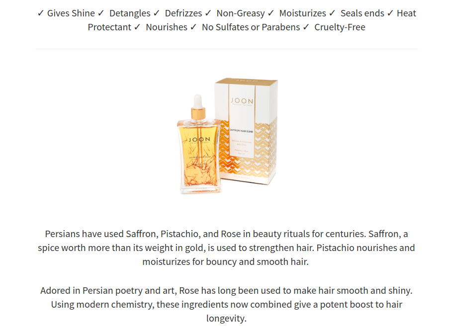
You want to minimize the steps required to enter a contest. Adding the relevant product information (as shown in the image above) will give people a better understanding of the prize without having to leave the contest page.
Social media contests are ideal for generating new leads for your brand.
Most users that visit a contest landing page will be discovering the brand that’s hosting the contest for the first time.
The quickest way to establish trust with a new audience is to list some of the publications that featured the product or some famous users of the product.

A small image like the one above can assist you in instantly building credibility with an audience that has little to no information on your brand.
To Sum Up
A contest landing page is similar to an online sales page that is designed to automate the sales and lead generation process. In the case of a contest, a contest landing page can automate a contest entry method.
Contest landing pages can be simple and to the point. The goal is to persuade visitors to enter your contest while keeping the entry method as easy as possible. You don’t want people to leave halfway through a long entry method.
Try to pitch your contest with a single offer that can easily stand out. In most cases, images and video will tell a better story than text. Keep text to a minimum and add quality images of the prize.
Always optimize your landing pages for fast page load speeds and for high traffic volume. You can quickly gain a user’s trust by adding logos of brands that have used your product.
Jack Paxton is a full-stack marketer and co-founder of VYPER and Hyax. Jack is a regular speaker at conferences, guest writer, and webinar host. His passions are entrepreneurship and marketing.
Article by: Renderforest Staff
Dive into our Forestblog of exclusive interviews, handy tutorials and interesting articles published every week!
Read all posts by Renderforest Staff

 Source: VYPER