
Case Studies
What does it take to have a great design? Is it all about creativity? We have another answer: it’s a combination of creativity and good planning. To plan a great work of art, you need to first know the basic elements and principles of design.
The elements of design are the tools you use to create a work of art. Knowing the fundamental elements and applying them to your piece with a clear understanding will help you make it powerful enough to convey a message.
So, what are the main elements that you need to know before starting to work on your blank canvas? Check out these seven basic elements of design that can take your work to another level.

Use this HTML code to share the infographic on your website:
Form refers to the positive element over the space of your work. Together with space, it creates a three-dimensional effect. The 3D objects include pyramids, cubes, and other abstract forms. You can make a 3D effect by using shadows, color, and overlaid objects.
It’s sometimes interchangeably used with another design element – shape, however, they’re slightly different. The form is mostly 3D and more realistic, while the shape is two-dimensional and flat.

When a line encloses an area, or when other visual elements are combined, we get a shape. Ultimately, everything around us is a shape one way or another, but for a designer, they are more important since they are the root of the most powerful logos. By the way, your logo can become even more outstanding if you use our logo animation maker!
A shape can be geometric or organic. The geometric shapes are precise and include shapes like triangles, squares, etc. Organic shapes have a more natural look with a curvy flow. They are asymmetrical and irregular elements and are associated with the natural world.
Creating a shape for your design piece demands attention and knowledge since they express a mood or convey a message based on their form, color, texture, and other attributes. For example, sharper shapes like squares are more masculine, while triangles direct the attention of the viewer to a specific point. And, abstract shapes are considered the basic shapes that provide building blocks for any kind of design composition.

Line is one of the basic elements of design made of points. Lines connect any two dots and can evoke various moods based on their texture, direction, look, and weight. A straight line, for example, is more balanced and structured, while a curved line is more dynamic and artistic.
There are different types of lines: vertical, horizontal, diagonal, lines, and curved lines. A line can be smooth, rough, broken, thick, or thin, and can have color, texture, and even movement.
It’s usually used to divide the content of your design or website, to frame a composition, and well… it does have many options for usage.
Color is an important element of design that shouldn’t be neglected. It gives a certain feeling and personality to your piece and can be applied to any of the other visual elements. To use this design element right, and choose the colors best suitable for it, you have to at least get acquainted with the color theory, learn how to use the color wheel, how to combine multiple colors, and what color schemes evoke certain feelings and emotions.
For example, blue usually evokes emotions of tranquility, trust, and stability, while red is a louder color expressing passion, excitement, and sometimes anger. So, knowing the psychology of colors will help you decide whether you should go with red, blue, or maybe yellow and what colors you should mix with them for the best result.

Besides being an important addition to the other elements of design, color can absolutely stand alone on its own. Design compositions made up of color and text, are simpler and have a greater impact if you’re trying to make a point.
Another aspect you should pay attention to when working with color is its characteristics:
Hue – It’s the name of a color in its purest form. For example, red, green, magenta are all pure colors.
Saturation – It’s the intensity of a color. It makes colors more vibrant or more muted.

Tint – It’s the intensity of white in a color. If the level of tint is higher, the color will be lighter.

Shade – It’s the intensity of black in a color. The higher the level of shade is, the darker and moody the color will be.
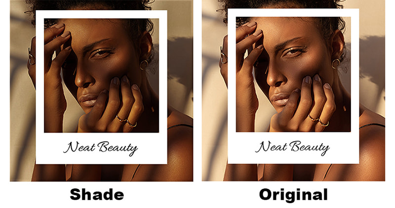
Value – It’s the lightness or darkness of a color. Lighter colors have a higher value than darker ones since they are closer to white. In design, it’s used to create emphasis.
By using different tone values for your objects, you can create more emphasis and movement. The value changes of the objects of your design create contrast, which we also often use in photography.
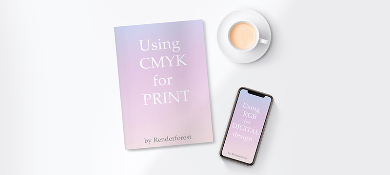
And finally, your design can have one of these two color systems – CMYK or RGB. To choose the right one for your art, you need to first analyze where it’ll be used.
Cyan, magenta, yellow, black (CMYK) are the four basic colors used in printing, so if your design is going to have a digital version, it’s the best option for it.
The red, green, blue (RGB) combo is the best choice for digital designs. After finishing your design, the colors won’t change once you post them online for people to view on screen.
Recommended Reading
Visual texture refers to the appearance and quality of a surface, suggesting what it’s made of. Just like shape, almost everything around us has texture and we can feel it both with a touch and sight. It can make your line, shape, or form soft, rough as a stone, fluffy, etc.
Of course, we can’t actually feel the texture of a digital design, however, just by looking at it we can experience the feeling. It breathes realism and visual value into the objects used in your design and can give them a 3D effect.
However, do be careful with the texture choice of your graphic design. Don’t choose a texture that’s irrelevant to your design, or it won’t have any effect on the viewer.
Say, you’re making a design for a flower shop, you can’t choose a darker and wooden texture for your objects. Colorful and soft textures are more relevant.
Also, it might not be a quite good idea to mix multiple textures in one single design. It will be too much for the eye and make the viewer confused as to where to look first.
The text, the words you add in your design play a huge role in making it a success, but the way you put them – their style, play as much of a great role. This makes typography one of the most important graphic and web design elements. It is the actual carrier of your message and the mood creator.
You can set the tone of your design using typography alone, and help the viewer realize what it is – an announcement about a serious cause or about a cute and fun event.
For example, Serif typefaces are more official, while Script typefaces are more creative and less official. So, using them with relatable themes will help your design have a greater effect.
Typography also creates a visual hierarchy in a design, by telling the reader where to start and where to go. You can do that by choosing different characteristics for your text, such as size, color, height, and weight.

Of course, it’s important what designers add to their web and graphic design, but what they don’t add is equally important. Simply put, space is the vacant area surrounding a shape. It helps to highlight the focal point of a design, simplify its readability, and make it pretty for the eye, without going overboard.
White space gives breathing space to design elements and helps to improve the visual hierarchy, the way the eyes navigate through your design.
Negative space refers to the area surrounding the design elements that forms an interesting shape to enhance the design. The negative space helps to define and highlight the positive space.
The right balance of negative and positive space makes the composition complete and helps to create visual interest.
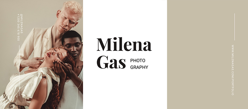
Sometimes less is more, and sometimes less is everything, so space makes sure everything is where it’s supposed to be on your design. It highlights the important elements and makes it easier for the viewer to catch the main message of your digital design.
So these were the seven basic elements of design – form, shape, line, color, texture, typography, and space. These various elements can make your piece successful when used right. To do that, you’ll need to practice, experiment, and learn the rules of applying them, known as the principles of design.
A beautiful design is a mix of imagination and planning, so plan your design, let your creativity fly, and if necessary, later distort the rules slightly with class and confidence to create harmony. However, don’t forget that to break the rules, you have to know them well first.
Excited to create your next design piece, but don’t have enough time and energy? Click the button below to choose a template from the Renderfoest Graphic Maker and edit it.
Article by: Renderforest Staff
Dive into our Forestblog of exclusive interviews, handy tutorials and interesting articles published every week!
Read all posts by Renderforest Staff

