AI
Marketers bear heightened pressure when crafting a presentation for their brand. For them, it’s not just about delivering a compelling pitch; it’s about showcasing their prowess in the very act of promoting.
After all, if you can’t captivate an audience with your presentation, you will hardly be trusted to run an entire brand promotion campaign professionally.
The first three slides are crucial to the success of your marketing presentation. Stats say 80% of those who read the first three slides usually stay engaged throughout the whole presentation.
Among the key factors keeping your audience hooked on the presentation is the design. And though this claim seems pretty obvious, for 50% of presentation makers, it’s hard to design their pitch from scratch.
Around 21% work on a marketing presentation template, and 15% reuse the same template that worked well before.
Ready-to-use marketing plan presentation examples indeed make presentation-making easier.
You can check some great templates from Renderforest if your next marketing presentation due date is fast approaching.
Meanwhile, we continue unwrapping the features of great marketing presentation templates that convert.
First, what is a marketing plan presentation, and what should a good one look like?
A marketing plan presentation is a visual report or document that provides a comprehensive outline of your brand and the strategies implemented to achieve its objectives. It can include elements such as target market, goals, tactics, SWOT analysis, budgets, timelines, ROI calculations, and more.
Marketing presentations are usually prepared and presented by marketing professionals, freelancers and agencies to showcase their abilities to potential clients. These pitches are usually presented to C-level executives of an organization and are meant to influence their decision-making.
For example, if a marketer requires a budget to run a promotional campaign, they must put forward a persuasive presentation that explains the need for the campaign and how it will benefit the company.
The crucial element of any marketing presentation is to show the financial results of the plan. You should be extra clear and straightforward when it comes to projecting the ROI. That’s why the best marketing plan presentation examples include financial slides with exact calculations and projections.
Other than that, a marketing plan presentation typically includes the following.
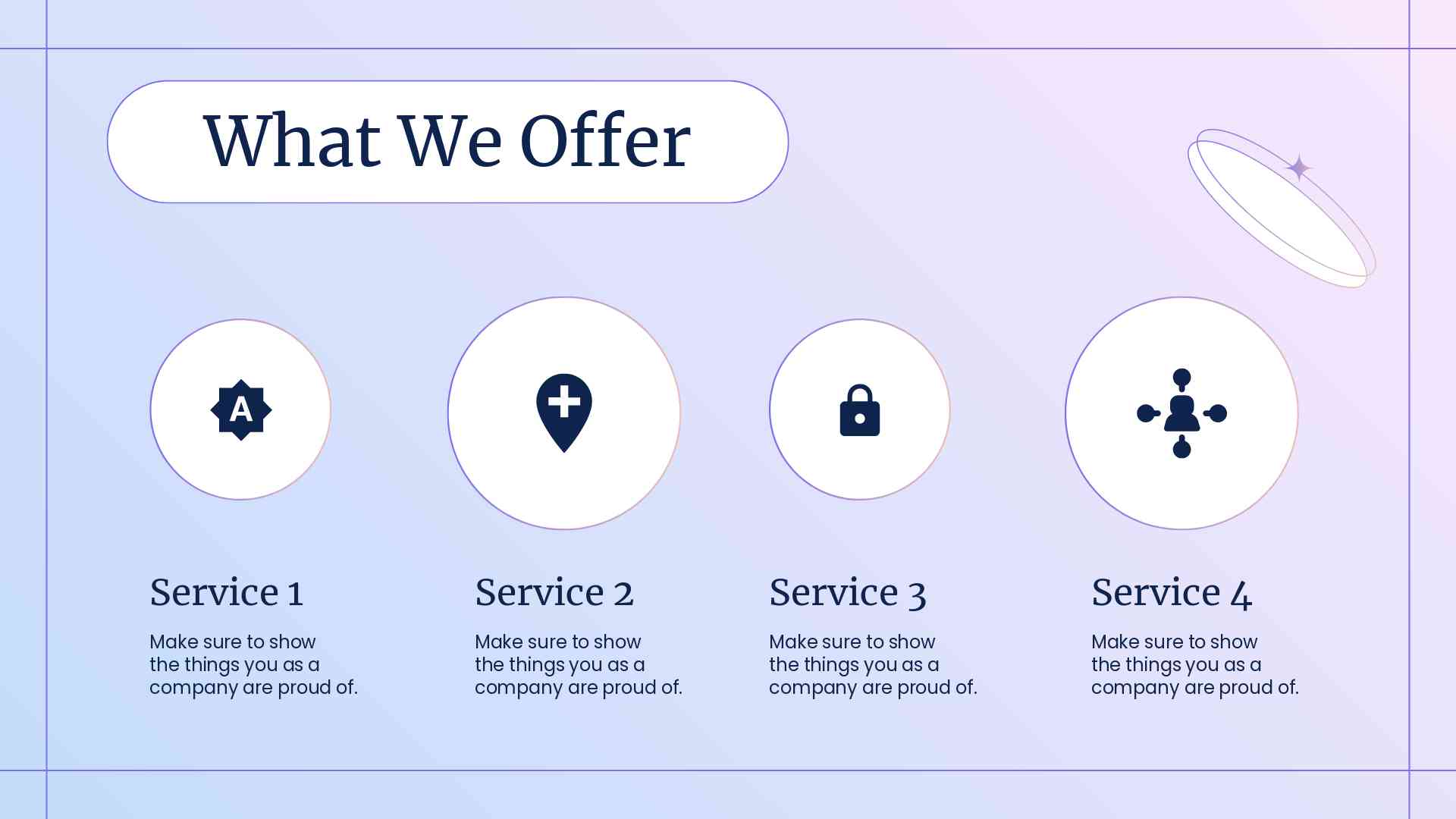
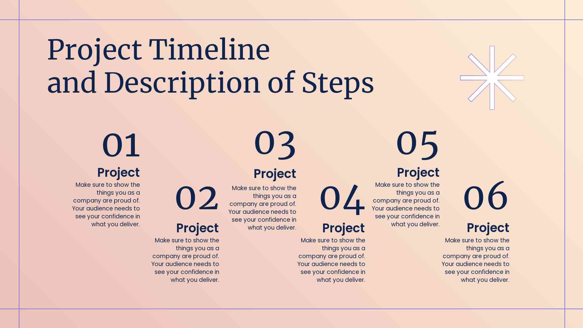
Welcome to the easiest way to generate a professional-looking marketing pitch. Renderforest offers a range of marketing presentation slideshow templates that are versatile and customizable to suit your needs. You can also explore corporate video templates for a more dynamic presentation experience.
 |
 |
 |
You can customize the look and feel of each template with our user-friendly drag-and-drop editor. You don’t have to be tech-savvy to work around the design interface; all you need is a creative eye for detail.
What’s more, you can choose from hundreds of graphic elements like icons, images, and illustrations to make your video content marketing presentation more visually attractive.
You also get access to a library of royalty-free stock photos that you can use without additional license costs.
Whatever brand presentation template you choose, here are six tips to help you create a strategic marketing presentation that converts.

Keeping your audience engaged, no matter how interesting your marketing presentation is, remains a challenge for all of us.
A dull first slide with irrelevant content or a failure to start with the ‘why’ of your audience’s interest leaves a low-energy impact.
So, our best advice is to MAKE A PRESENTATION THAT IS TAILORED TO YOUR AUDIENCE AS MUCH AS POSSIBLE.
And that’s not about relevant content only. It’s also about language and style that’s more understandable for your audience. Try to answer these questions before you start designing the presentation:
Here are some working tactics to connect with the audience effectively.
Though your goal is to get your marketing plan approved, each time, you present it to people with different own goals in mind.
Is there a tough financial time for the company? Emphasize cost-saving plans and economical tactics.
Are the decision-makers suspicious about the new projects? Ensure you have more than enough data to back up your strategies and enrich your presentation with many examples.
It’s of the utmost importance to document and deeply analyze your audience before you start designing the presentation. This technique includes conducting research to collect data about your target audience, including…
Here’s a quick guide to help you define customer personas for your presentation.
Featuring you or your team on the first slide with a hooky question, statement or teaser video might be a great way to grab the audience’s attention.

Starting without visuals can also work. Just choose a bright, attention-grabbing color and think well about what you’re going to say in the first few sentences.

The human brain is 22 times more likely to remember facts presented in a story format compared to plain facts.
That’s why your strategic marketing presentation should have a logical, compelling story structure that’s easy to follow and remember. Here are some storytelling techniques you can use to make your presentation more effective.
Pick a character, ideally your client or the key stakeholder, that’s going to meet a goal as a result of your proposed plan. Further, develop a story that shows the hero’s journey toward success, projecting your plan as the key solution.
Read more about the hero’s journey technique.
That’s the most classic story structure technique used in films, novels and other forms of media. You should introduce a setup, move to a rising action or confrontation, and complete your marketing presentation with a resolution. This allows you to emphasize your marketing campaign’s importance and outcome.
Read more about the three-act structure technique.
When the topic seems too complex to explain or too boring to listen to, metaphors and analogies can save the day. An effective metaphor usually involves a comparison of two, unlike things to explain a concept in an easy-to-understand way.
For example, you can explain the importance of customer data with something like “Customer data is to marketers what fuel is to cars; it’s what drives our strategies”.
Read more about metaphorical storytelling.
 |
 |
 |
A constant line of corporate branding should stretch through every slide of your presentation. Why? Because branded presentations show an organized and professional approach of a presenter and evoke more trust from the audience.
Besides, having a unified style and colors in corporate presentations is an accepted norm. Consistency in the design of slides helps to bring your ideas together, making them easier for an audience to understand visually.
Look how this HubSpot presentation features the company’s orange color in all slides, from the introduction to the conclusion.
You can choose any style you want to follow in your marketing presentation. That can be your or your marketing agency’s style guide or you may choose to design your pitch with the client’s corporate identity.
The crucial thing here: be consistent. That’s a key factor in making your slides look professional and presentable.
With one click, the color palette, font size and style, backgrounds, and icons of your presentation will be adjusted to your brand’s design and identity.

Renderforest has a robust editor working with the straightforward drag-and-drop technique. It allows you to paint your slides with the corporate colors in just a few seconds without any design experience!
What does your audience see when looking at your marketing campaign presentation?
It’s very visual detail added, their colors, and the design of the text – font, text color, size, and spacing.
These three crucial design elements can’t be guessed or left to the presenter’s personal preference. There are tried and tested, scientifically proven design principles for making a presentation powerful, attractive and readable.
Here are some of them.
The human brain dictates its rules. Most of us tend to follow a Z pattern when looking at slides with many visual elements. This means we will look at the slide from the top left side to the right and diagonally move to the bottom of the page.
So, slides with heavy visual components should be designed in a way that viewers are guided through the page following this pattern.
And when there is much text on the slide, our brain moves to the reading, the F pattern most of us are used to. Text-heavy slides are viewed from the left to the right until the text is finished.
Consequently, presenting text in blocks, separate from visuals, and keeping the structure of text balanced and organized should be among your top priorities.
Aside from that, there are some golden rules to keep.
Back in 1666, Isaac Newton invented the color wheel – a tool that is still used by designers and marketers to create more powerful visuals.
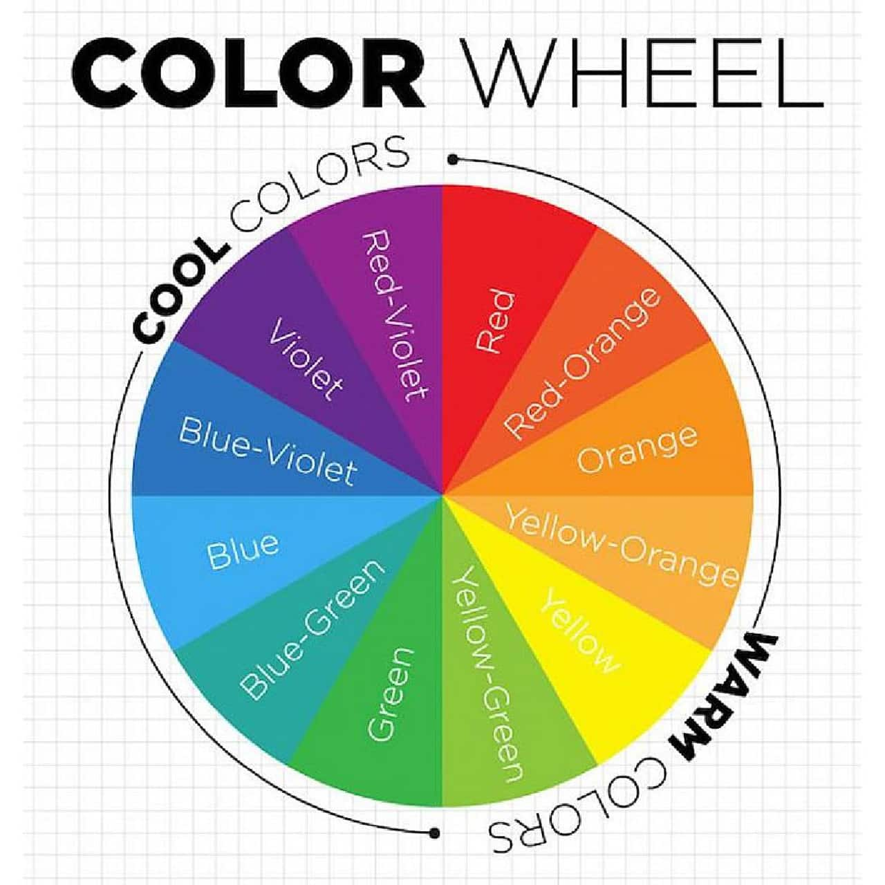
It’s a condensed version of most colors in the universe and consists of three color groups.
The purpose of this theory is to help balance the colors on the slides and create an eye-catching combination of hues. The wheel is divided into warm (more suited for action-evoking marketing presentations) and cool (more suitable for thought-provoking conversations).
The neutral pastel palette can work well in most cases if the brand guidelines don’t require bold colors.
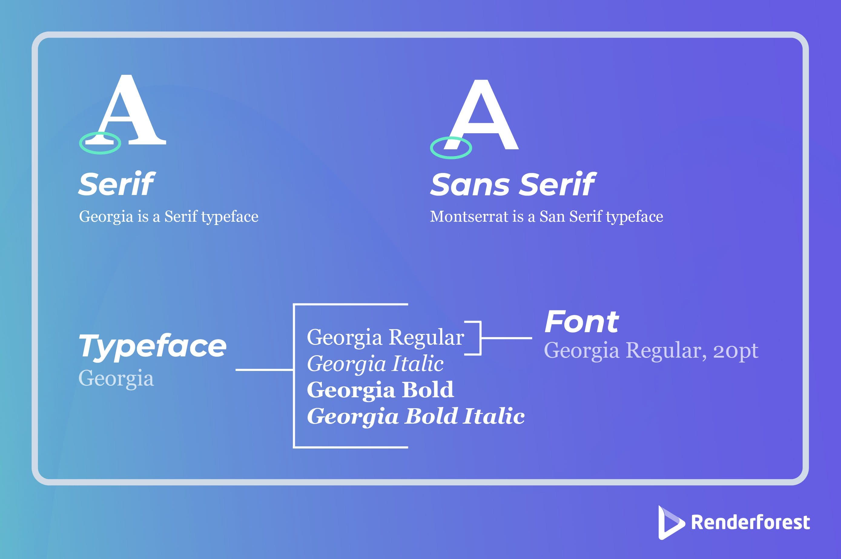
Lastly, the fonts you choose for your presentation should be easy to read. It’s also recommended not to go too bold and with a maximum of two typefaces in one slide.
For titles, choose a font with personality and readability; for body text, select something simpler but still eye-catching. It would be wise to stay away from rarely used fonts as they may be unreadable for some viewers.
At Renderforest, we’ve combined the best fonts used by designers for maximum readability and visual appeal.
You can skip the manual work of finding the perfect font and color combination for your marketing presentation. Renderforest offers a long list of ready-to-use, pre-designed sets that look modern and professional.
They align with all the key design principles, so you can be sure your presentation looks visually perfect.
Just head to the left-side editor in your marketing plan presentation template, open the color and font sections and click on your favorite combination.
Say, you want to convince your clients that shifting to short-form videos is a profitable marketing strategy for their business.
It would be far easier to do if you bring an example of Company X – preferably from the same or related niche as your clients, that successfully tested this strategy and achieved great results.
There are many marketing case studies available online. With thorough research, you should be able to find one related to your topic.
Also, leverage your own networking connections. Show some insightful stories from your own customers, how peers in the same business are experiencing success, or how competitors moved in a different direction.
These stories provide tangible evidence that helps you prove your point. Statistics are helpful, but real-life examples speak louder and paint a vivid picture of what benefits can be achieved.
We know you want to present a marketing 101 presentation of the century, with every important detail included.
But you have to filter your marketing presentation content to make it concise, structured and easy to understand.
Overloaded presentations, even if the material is correct and interesting, are very likely to bring the opposite effect. People have short attention spans, so the best way to succeed is to keep it simple and provide only the most important points.
Here’s how you can achieve this.
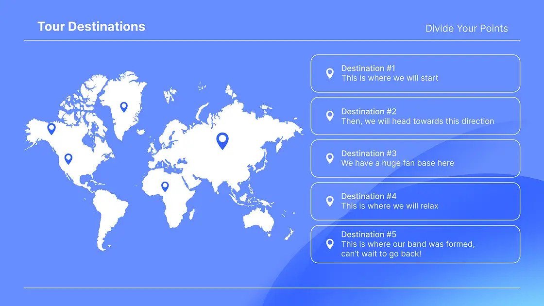
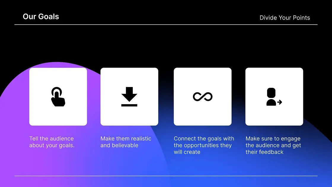
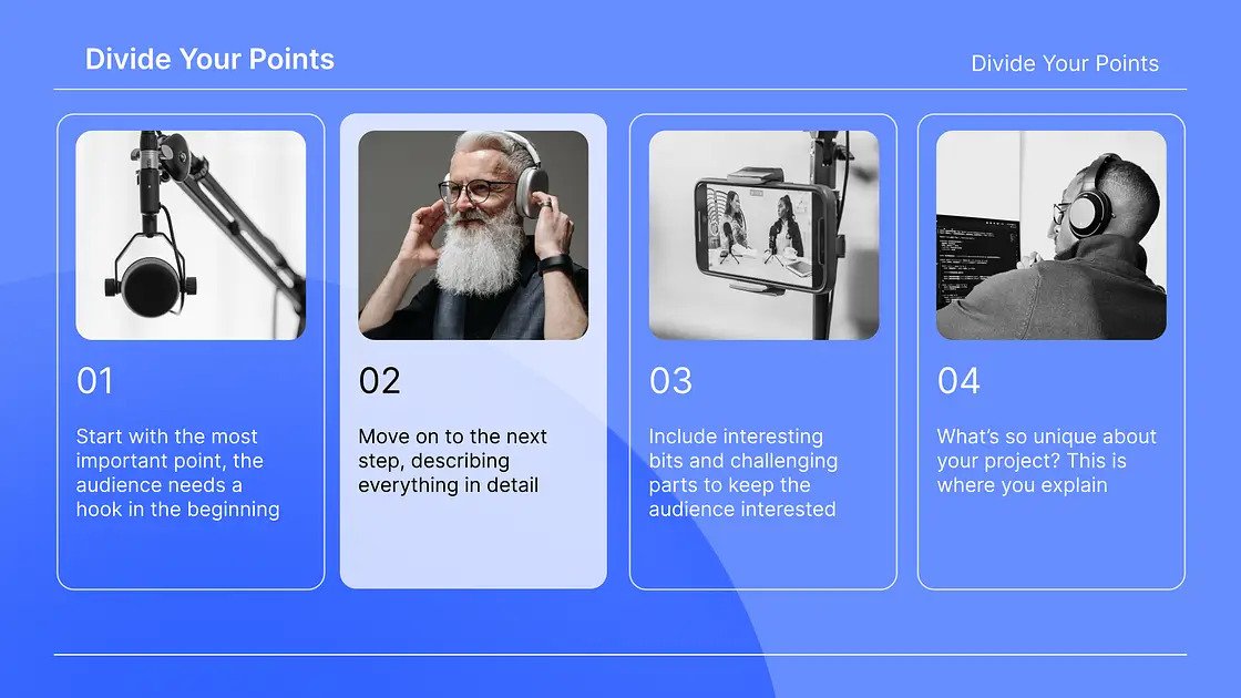
Renderforest offers you marketing presentation templates that come with balanced sections of text and visuals designed to make your work easier.
You can have a summary of the key points, an introduction slide, timelines for future actions, budget plans, and more – everything included in one template.
Meanwhile, every product presentation template is designed with a healthy doze of white space and an amount of information that’s considered optimal for the audience.
 |
 |
 |
Time to move to ready-made marketing presentation templates designed by Renderforest’s professional design team.
The goal of these templates is to accelerate and simplify your marketing presentation creation process by eliminating the need to brainstorm design concepts and decide on the content.
Just enter your information into pre-built slides, customize the colors, fonts and images, and you’re good to go!
Here’s a brief overview of how to customize each template for maximum results!
Here are some great packs to start with!
 |
 |
 |
Most suitable for:
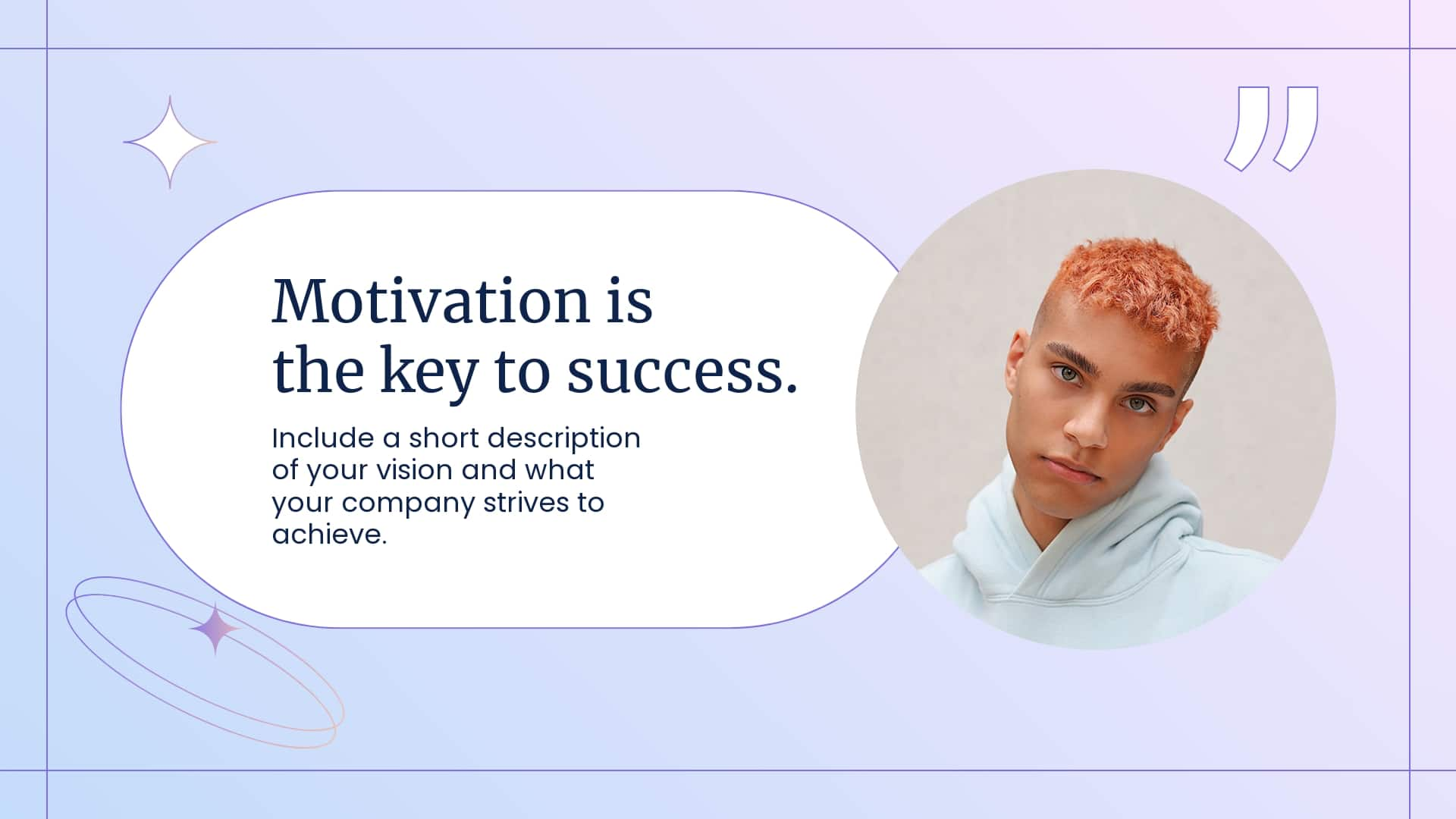
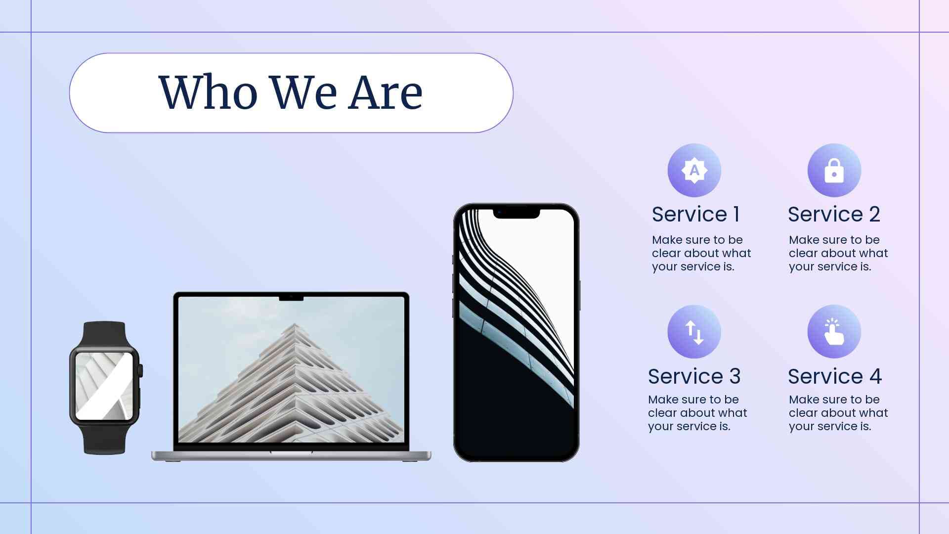
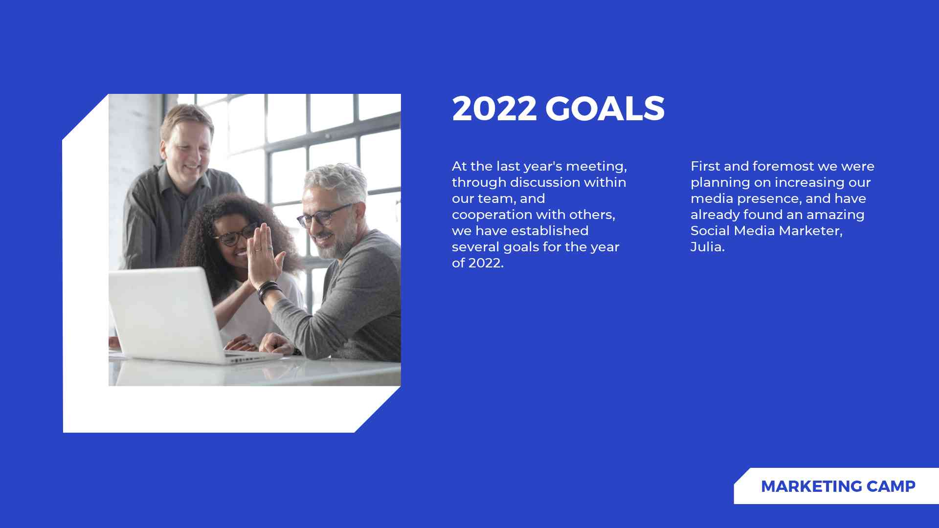
Calm colors, with mild gradient color combinations and a professional presentation style – that’s what this marketing plan presentation is all about. It’s initially designed to Introduce meetings, big and small presentations, classes, etc.
The goal is to help you present your company or organization in a relaxed yet serious way.
That’s one of our most human-centered marketing presentation packs, with many default team member images included. Though you can customize it the way you want, we recommend keeping this style in case you need to introduce your team or organization.
The slides are not text-heavy. Most emphasis is on visuals and images, to make sure you keep your ideas concise.
There is also plenty of free space on each slide to ensure the optimal look of your marketing presentation.
If you need more analytically-focused slides, scroll down to find slides with more condensed information. We recommend including no more than 3-4 such slides in the presentation, as more than that may seem overwhelming.
Overall, this marketing slide template is designed for minimalistic and simple presentations. It may not be the best pick if you require detailed data and technical information.
 |
 |
 |
Most suitable for:
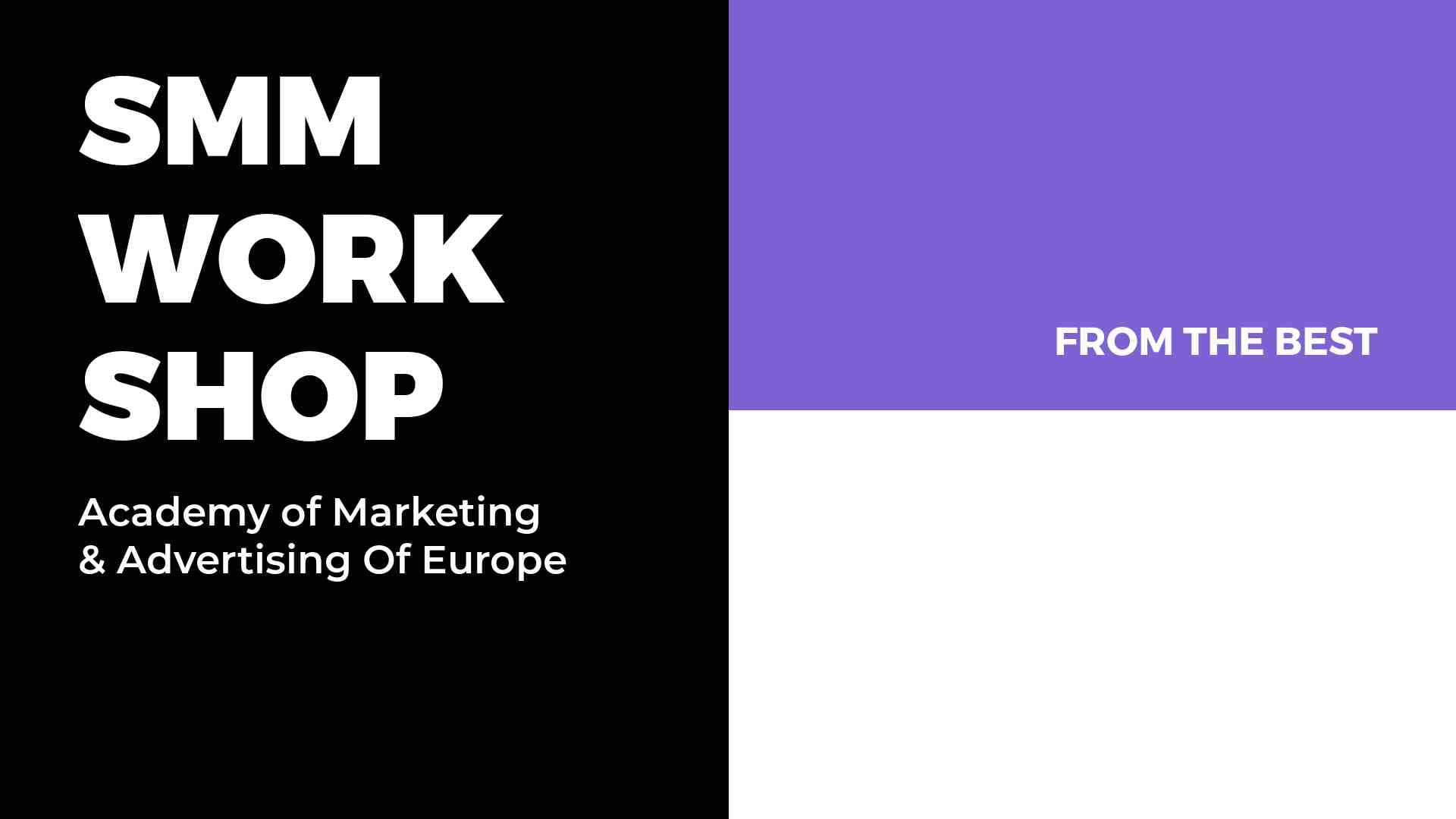
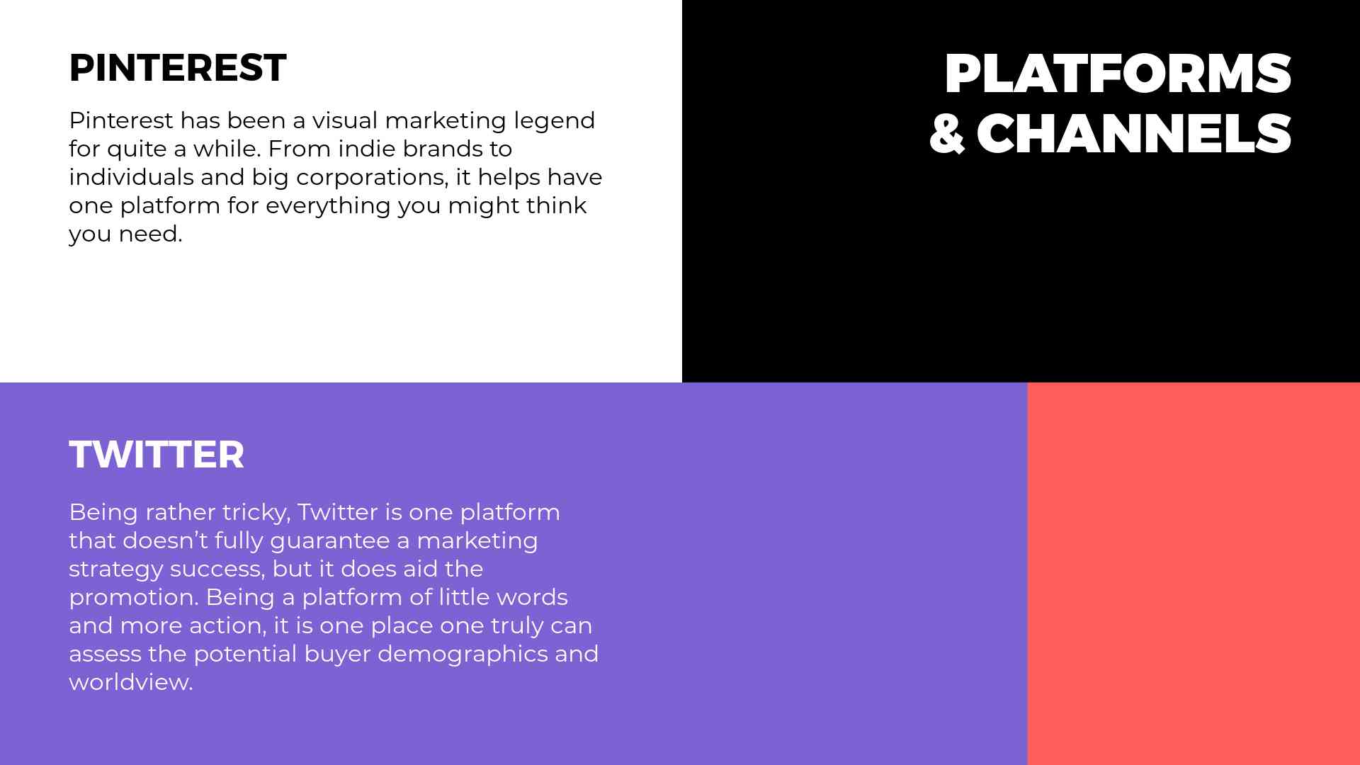
Working on your next social media marketing presentation? Here’s a pack that features bold colors with balanced texts, leaving plenty of room to include all the details on the new social media trends you want to catch or to analyze your company’s performance on a certain social network.
This brand presentation template is significantly more text-heavy compared to the previous one. The default version also includes fewer visuals or icons. The most emphasis is on the text because data and stats are crucial if you’re preparing a social media marketing presentation.
This pack features a more dynamic vibe due to bright colors that resemble trendiness. There is no calmness or relaxed feeling, which, if used right, can keep your audience constantly engaged in your presentation with no tiredness.
We recommend having 7-8 slides from this marketing plan presentation template. Because they are designed for more statistics and data, more than 8 slides may seem too much in terms of information intake.
Almost all slides are divided into proportional sections to dedicate each of them to a certain social channel. That’s very practical if you’re comparing different social channels and need the side-by-side design for that.
 |
 |
 |
Most suitable for:
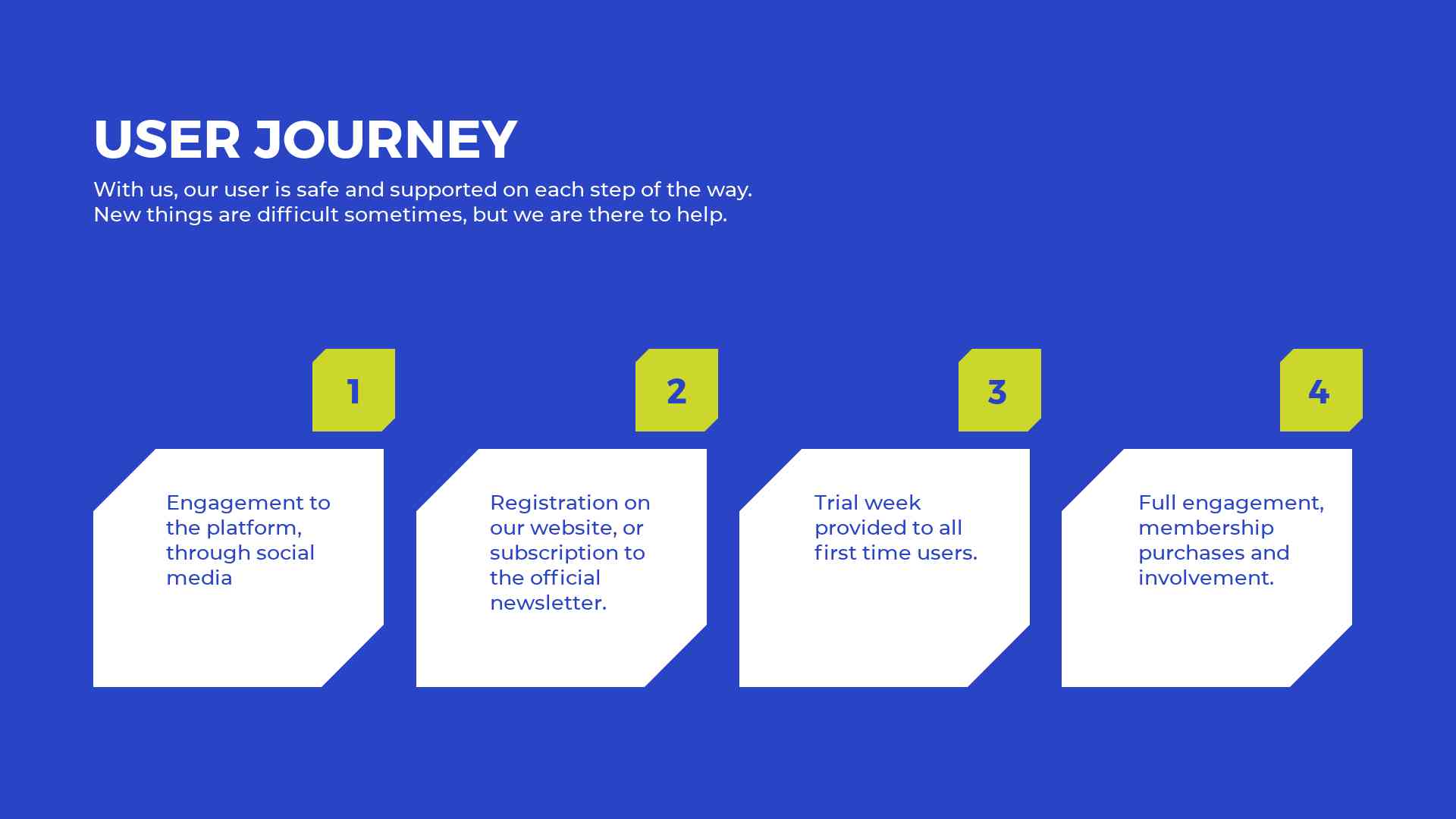
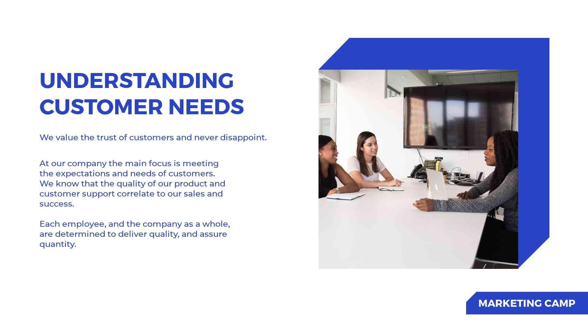
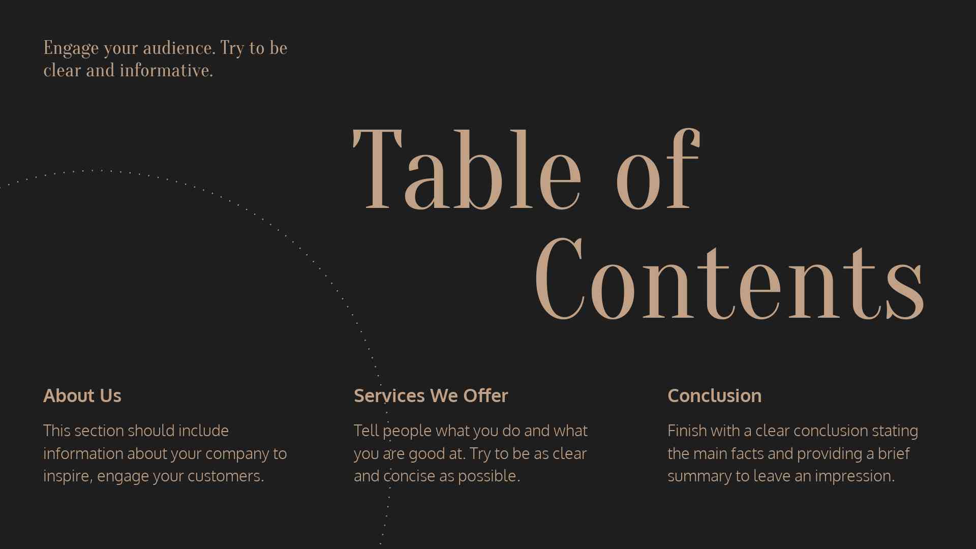
Most of you may think of a strategy presentation as something in nude, grey and black colors with sharp edges and a lot of text. But that’s not always the case!
In this marketing strategy presentation template, you’ll find a combination of two contrasting colors. Dark blue is an all-time classic for professional, trustworthy presentations that evoke trust and respect.
Meanwhile, we mix it with a neon green-yellow color to create a bit of a modern and playful look. This is more suitable for young brands, startups and other companies that have different values than traditional or conservative ones. You can even customize it more with animations using the animation maker.
For example, you can use this pack for financial strategy presentations in a company where a dynamic and joyful approach is appreciated. You can also use it for even more serious topics when you want to make sure the audience won’t get bored.
In case you don’t want to risk it, you can always put more blue slides in between the green-yellow ones. That way, you’ll make sure to keep the presentation on a professional level and still take advantage of this modern approach when necessary.
We especially like the cascading timeline slides in this marketing presentation template. Perfectly reflecting visual hierarchy rules, these slides are great for timeline, progress or process presentations.
 |
 |
 |
Most suitable for:
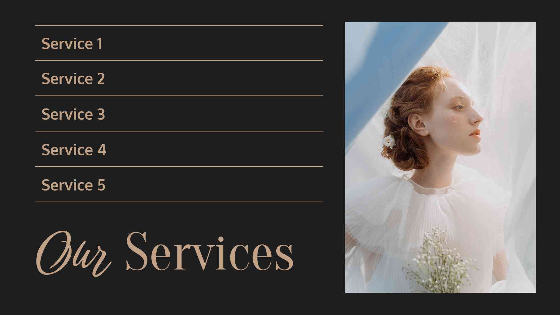
Following the best trends of today’s fashion industry, this marketing 101 presentation template is all about pastel colors, silky curves and playful shapes. It’s definitely the most fashionable presentation of all four, so we’d recommend using it when discussing new trends or fashion collections.
The pack features a huge collection of fashionable images. These are model photos of the best quality, so you can keep the professional look of your fashion presentation. There are also aesthetic photos of textiles, garments and patterns that complement any collection of a fashion designer.
The slides are dynamic due to more than just visuals. There are also curves and geometrical shapes, as well as silhouettes. Overall, the vibe is like you’re just sitting in a fashion show, watching all the new looks and walking down the runway.
We like that this template still keeps enough of its minimalistic roots. With just one or two such slides, you can make your presentation look modern and stylish without overloading it with lots of visuals.
Probably, you will need to add your custom photos to complete the look, but that’s OK. The slides are designed in a way that you can insert any image, and it will still look great due to its modern design.
 |
 |
 |
Most suitable for:
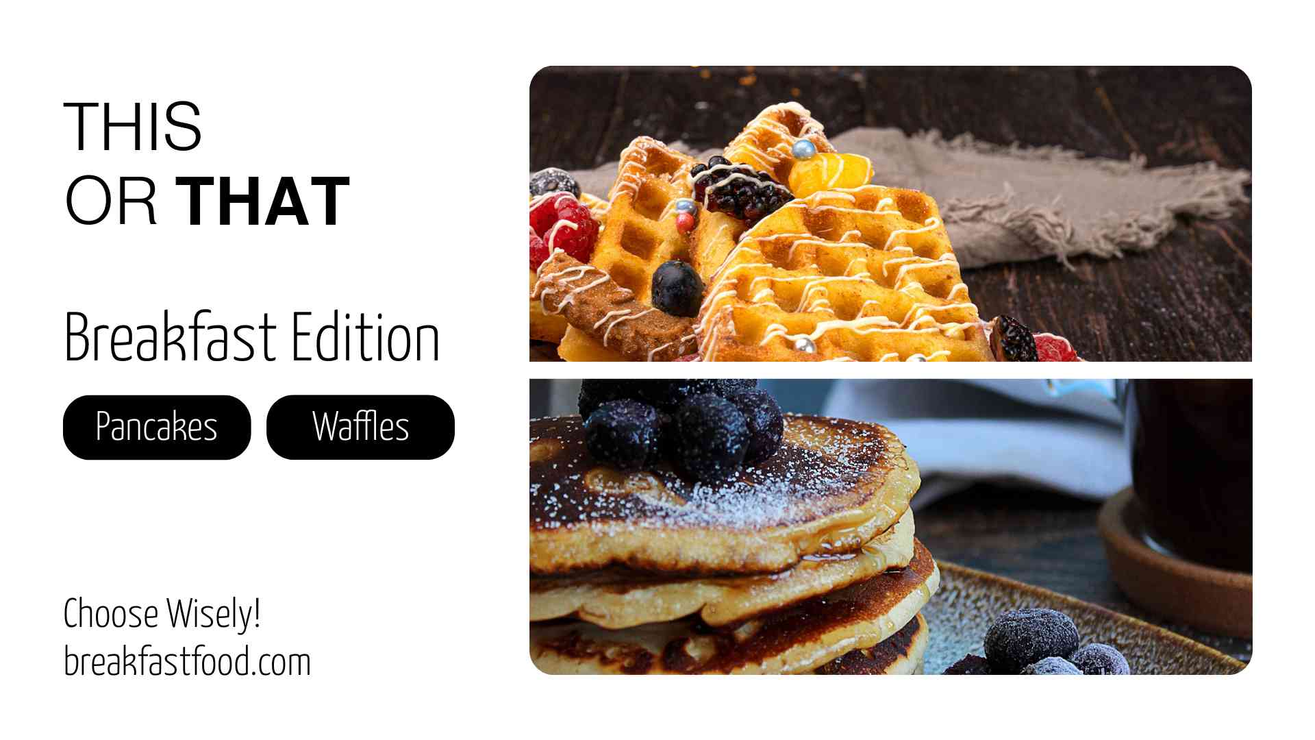
If you’re in the food industry, here’s a product presentation template that will make your presentation look appetizing. This marketing slide presentation template is all about food photos! And not just photos of the food – there are also images of chefs in their working environment, adding a more professional approach to the slides.
The color scheme is extremely diversified. You’ll find pastel colors, bright ones and even muted ones. We especially like the photos that feature fresh foods, drinks and beans on a plain white background. This mix of colors and photos will make your presentation look tastier.
What’s unique in this marketing presentation example is that it seamlessly combines animated and real food photos. There are also animated and real cooks in the kitchen – something that may seem irrational from the perspective of design, but it looks very natural and realistic.
Scrolling down, you’ll find slides for everything you may want to present related to cooking and food. There are slides to present the nutritional value of certain foods. In parallel, you can find ready-to-use menu pages with prices and portion options.
That’s one of our richest marketing presentation templates with 110 scenes. So, the stage is yours for whatever you want to present.
 |
 |
 |
Most suitable for:
White, yellow, and light grey in the background – tell us about familiar and trustful tones that work well in the online world. This marketing presentation template is a perfect choice for those who are searching for something to present digital topics.
Quite rich in visuals, animations and texts, this pack will be enough to present any educational topic related to online marketing, and not only. Present your course agenda, show the takeaways potential students will get or explain the structure of your course.
The slides are full of creative illustrations, flat icons and animated elements, so you can easily break down complex topics into simple visuals. If you want to be more specific about a certain topic, there are also images with text boxes where you can input some additional information.
In case you have online marketing data to present, you can also use the slides for that. This template includes a lot of charts and graphs, so it’s easy to show metrics related to website performance or other digital topics.
The best part about this online marketing presentation is that it looks modern and creative. You’ll keep your audience interested in what you have to say if you’re using modern visuals like these.
 |
 |
 |
Most suitable for:
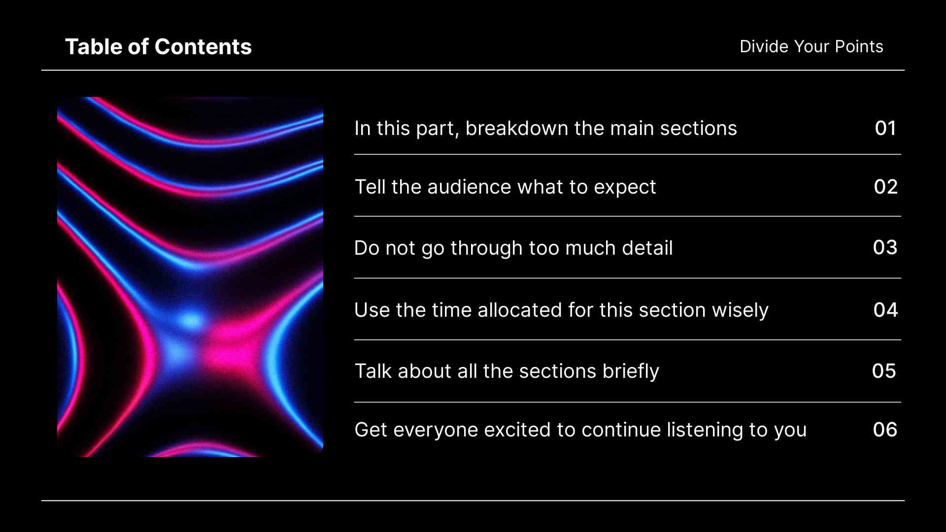
If you’ve ever wanted to make static graphics sound like music – here’s a marketing presentation template that will help you with that. It’s about notes transformed into illustrations and curves in various colors.
The backgrounds and design resemble a music visualizer giving you a psychedelic and trippy vibe. Featuring mostly dark tones, a club-like atmosphere will be present in all of your slides.
The presentation is suitable for any kind of music topic. There are illustrations featuring musicians and their instruments, so you can explain the idea behind every concert. There are also slides for musical awards one got during their career or slides with iTunes or Spotify buttons that you can use to promote your music.
The pack is also ideal for any kind of audio-related topics – from podcasts to radio programs. You will find various images with headphones and other audio-related items, as well as photos in the audio visualizer where it all happens.
If you have sound engineers or producers on your team, you can use this template to showcase their work. There are visuals of analog and digital technology, along with slides for both audio and video production topics.
This article discussed some of the best and most versatile marketing presentation templates available. Whether you’re a small business owner, a marketer, an educator, or even a musician – these templates will help you make your point quickly and effectively.
Each template has unique visuals, animations and effects that will make your slides look modern and professional. Plus, they are easy to customize, so you can make the slides your own and send the right message.
So why not give them a try? Pick one closest to your topic and start creating your presentation today! But that’s not all; packs like the teaser video templates help you build hype around your product, event, or creation. You can even market your personal brand using our video portfolio editor. If you ever need help customizing your content, remember that our team of professional designers will be more than happy to help.
Article by: Renderforest Staff
Dive into our Forestblog of exclusive interviews, handy tutorials and interesting articles published every week!
Read all posts by Renderforest Staff

