Case Studies
What designs come to your mind when you think of famous logos in the world? Maybe the blue and red combination of Pepsi or the apple of the iPhone? The most popular logos you can recall now are the result of hard work, successful storytelling, and creativity.
Most brands have their logos, but how come some become famous worldwide, while others stay unrecognizable forever?
In this article, you will find out how to create a new logo for your brand that will not take much time and effort but will still stand out with its unique and creative solutions.
Before designing a logo on your own, let’s get inspired by the most famous logo designs that belong to different industries following Statista’s database, and discover the secret to their success.
The logo of Airbnb definitely played a role in the company’s success. One of the priorities of Airbnb was to create awareness about its brand as they were going to develop a new industry. That means they had to educate potential customers on why they needed these new services and what benefits they would have once they start using Airbnb.
The company started digital advertising its services having the logo as the cornerstone of its advertising campaign. Due to the great logo design, the company became more recognizable online and increased the level of online interest in the new industry.
The secret of their iconic logo is that the latter looks simple but incorporates hidden meanings and designs. At the center of the symbol, you can see a teardrop shape that indicates a person’s head. That means the company is people-oriented. The same shape also represents the location icon. Besides the inner shapes, the outer upside-down heart conveys the idea of love. It also stands for the letter “A” in Airbnb.
Nowadays, many companies drastically change their logos from time to time instead of keeping their original logo designs. TikTok, however, is one of the exceptions. Although their app was released in 2016, its logo has undergone minor changes since then.
We have included this iconic logo on our list of most famous logos as it is easily recognizable and eye-catching. This logo was and still is an inseparable part of TikTok’s advertising campaigns. Almost all the ads of the company contain this logo.
Moreover, due to its recognizable logo, TikTok started capitalizing it by selling products that feature the logo: apparel, shorts, shirts, coffee mugs, journals, and many more.
It’s even more surprising to hear that this logo was created by a young man who loved going to rock concerts. He tried to create the atmosphere of the concerts- the person who attends a concert is surrounded by darkness and looks at the colorful stage.
WhatsApp has one of the most famous green logos in the world! The logo represents exactly what the app is used for; it’s a famous mobile messenger that lets anyone share messages, voice and video calls, files, music, and photos.
The green logo of the company is a phone receiver inside the text bubble. The latter indicates instant messaging, while the phone receiver is there to tell the audience that the app can also be used to make video or voice calls.
WhatsApp’s logo design is a great example of a simple but famous logo. You don’t need to spend hours creating a complicated logo with any extra hidden meaning. The simpler the logo is, the wider audience it will reach!
Another famous logo with a simple but meaningful design! Like Whatsapp, Meta’s Messenger has an instant text bubble with a lightning bolt in the middle. This logo has undergone design changes several times, however, it remained popular. Initially, the logo was a blue color. Later more vibrant colors like orange, pink and purple were added to it.
LinkedIn has one of the most famous blue logos in the world, although the blue square of the logo was initially colored in black some years ago. Nowadays, blue is associated with the brand’s core values, and identity as this color symbolizes intellect, power, professionalism, and success. The perfect color to represent the social network for business communication and career development.
What could be a simpler logo for a video streaming platform than having a red play button? That is one of the logos that proves minimalism can work perfectly when promoting a project. The main colors used in this famous logo are black, red, and white to emphasize elegance, passion, purity, optimism, and excellence.
This perfectly balanced color scheme and minimalistic approach are some of the reasons YouTube logo design became so popular worldwide.
The Chanel logo is one of the most famous logos in the world today! You can see it everywhere- on shoes, bags, clothes, belts, etc. It is associated with elegance, luxury, and Parisian fashion.
The famous logo was designed back in 1925, inspired by the windows of Chateau de Cremat in Nice, France. This lettermark logo design is created with the initials of the business in a visually captivating way.
It contains 2 single colors: black and white. However, it perfectly indicates the brand identity and core values of this fashion house even if it’s printed on simple white paper.
We have included the Gucci logo in the list of the most famous fashion logos as its simplicity and uniqueness could be a great source of inspiration for you.
This famous lettermark logo was actually designed by Gucci’s son, Aldo. With the logo, he represented his dad’s initials. Later, it also started symbolizing bracelet links.
In 1951, the red and green ribbon was added to the logo design to honor Gucci’s home country- Italy.
If you ask people to name some of the famous black and white logos, they would never forget mentioning Nike in their logo list. Nike branding team chose the swoosh as their logo inspired by the wings of Nike, the Greek goddess of victory in Greek mythology.
With this simple logo design, presenting motion and speed, Nike shows how a single element can become recognizable throughout the whole world. Discovering the relevant logo symbol that presents the brand’s core values and implementing it in your marketing campaigns is one of the keys to success.
Of course, we couldn’t exclude McDonald’s from our most famous logos list. McDonald’s logo has become one of the symbols of global expansion and the spread of American culture. Its famous golden arches appeared right with the opening of the first McDonald’s restaurant.
The yellow and red colors of the logo highlight McDonald’s brand identity. Red is there to represent stimulation and energy, while yellow communicates happiness and positive emotions. This combination of yellow and red in the logo also led to visibility, letting people spot the McDonald’s locations on the most overcrowded road.
McDonald’s logo comes to prove that the secret to becoming one of the most famous logos in the world is finding the ideal combination of colors, shapes, and, of course, simplicity.
You might think that McDonald’s or Burger King has the highest number of establishments, but guess what? It’s Subway! The fact that Subway was founded by a 17-year-old boy Fred DeLuca is amazing itself.
Just like the humble start of Subway, its iconic wordmark logo had a humble start too. It included the name of the company with two arrows at the beginning and the end of the name. Although the logo has undergone several changes since 1965, the 2 arrows consistently remained a fundamental part of the business.
The arrows of the Subway logo design are there to highlight the entrance and exit of the restaurant and symbolize the way they serve food to people who are on the go. Just come in, order your food and leave with your food in minutes.
During the company’s first redesign, the logo’s arrows became more highlighted. Later, green and yellow colors were added to split the title. The “Sub” part is now depicted in yellow, which symbolizes the color of their products, like bread, cheese, etc. “Way” is colored in green to emphasize health and movement.
Baskin-Robbins is a fast food brand specializing in ice cream and cake. The company has one of the most famous wordmark logos now. Its blue and pink colors look fun and childish, similar to the menu they offer.
What’s interesting about the Baskin-Robbins logo is that it includes a hidden meaning. The pink elements of the letters B and R show the number 31. The latter is the number of ice cream flavors offered by the company.
All fast food lovers of the world are familiar with the image of KFC. This fast food chain released many versions of its logo since its opening in 1952, with the KFC letters and its mascot Colonel.
As you can note red is commonly used for many famous fast food logos. The secret to their success is that this colour evokes a sense of warmth and hospitality, incentivizing busy people to enter the restaurant and get the food without having to wait for hours.
Another reason we have included KFC in the list of famous logos is that it is a perfect insight into how a mascot can make a brand more memorable and engaging. No one can imagine the KFC logo without the famous mascot now!
Another famous fast food logo designed in red! The company uses red to show its passion for providing its customers with freshly baked pizzas. Red also evokes the emotions of enthusiasm, energy, and love- the emotions that are mostly associated with young people.
The logo depicts a thin pizza crust with a smeared tomato sauce. It also has the skinny slice pizza design as its customers care more about their health and have become more health-conscious.
It should be noted that Fanta also changed their logo design from time to time. Recently, their rounded and bubbled logo font was changed into a pointy one. The latter is the special design by the company itself. Most adults became critics of the new design, saying that it is too annoying and twisted. However, adults are not their target audience and they barely buy this soft drink. Kids and teenagers love the new design and enjoy the drink not paying attention to the critics.
Now that you’ve got the dose of inspiration from famous logos across the world, it’s the right time to create your own logo with the help of easy but effective logo maker tools like Renderforest.
The main advantage of using Renderforest logo maker is that you don’t have to be a graphic designer to create a stunning logo design. Follow the 5 simple steps mentioned below and your perfect logo will be created in no time!
First, log in to Renderforest. If you haven’t signed up yet, you can do it using your Gmail, Facebook, or personal email address.
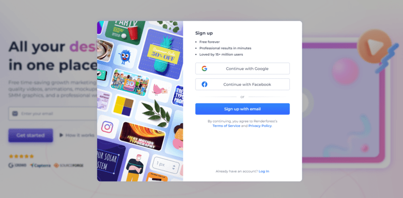
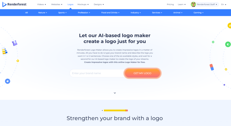
Once you sign up, you should go to the Renderforest logo maker by clicking on the “Logos” section from the menu above.
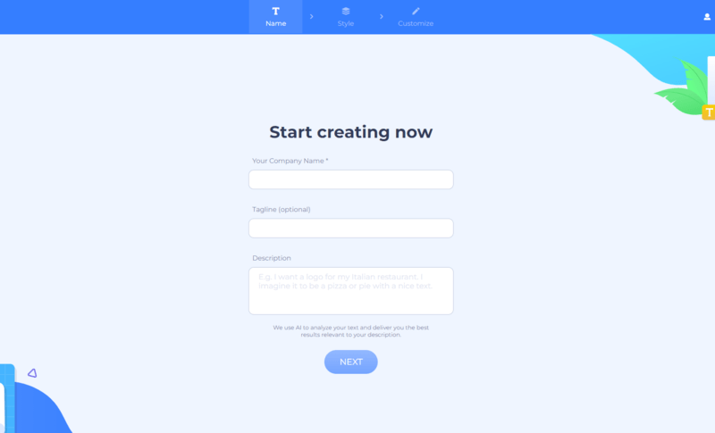
Keep in mind that only the first field is mandatory to fill. Write your company name and skip the tagline or description if you don’t have them for now.
Click on the “Next” button and choose the logo styles that most appeal to you. Renderforest offers a variety of logo styles, including emblems, solid, line, flat, gradient, watercolor, minimal, and alphabetical logos. You can pick a maximum of 3 styles or let our AI pick the style for you by choosing the first option.
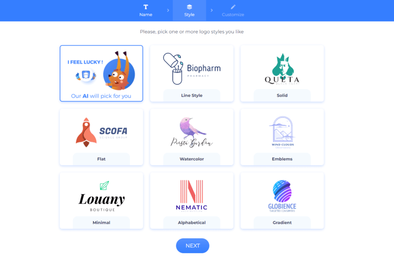
After choosing the styles, Renderforest will offer you a variety of logo designs that you can display on canvas. Renderforest will also generate mockup that will help you discover what your logo will look like on real-life objects before selecting the final one for your company.

Once you are happy with the style, you can edit the logo design to fit it with your brand by changing its colors, text, icons, and size adjustments.
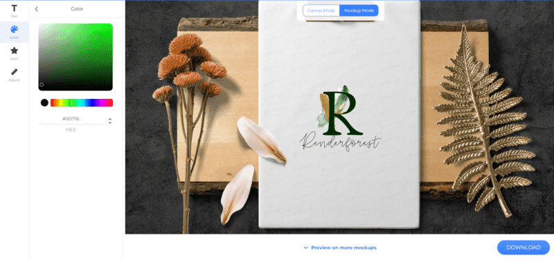
For instance, if you don’t like the suggested icon, you can choose a new one by searching for the relevant term in the “Graphic Based” icon section. If you want a wordmark logo, you can select the “Text Based” logo style, and the icons will disappear from the logo.

Preview the final version of your logo and take the last step by clicking on the “download” button below. Choose the free or monthly/yearly subscription plans and hit the download button to download the final version of your animation logo design.
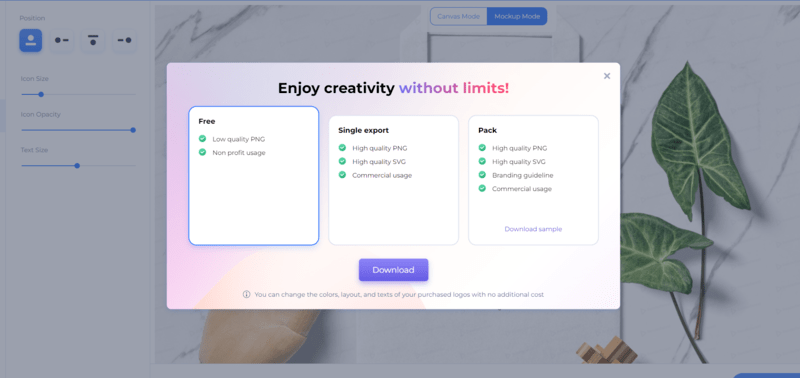
So! Your beautiful logo is ready in just a few clicks. Get it in your preferred logo file format and start promoting your brand on various social media platforms.
To sum up
Get inspired by famous logos across the globe to create the one that will stand out with its creative and unique solutions.
You can create a logo that perfectly fits your brand using our advanced logo maker that offers a wide variety of categories and logo designs. Click on the “Try now” button below and design the professional-looking logo in a few minutes without even having graphic design skills. With a variety of other tools and resources like TikTok video templates, Renderforest is your go-to solution for your content creation needs.
Article by: Renderforest Staff
Dive into our Forestblog of exclusive interviews, handy tutorials and interesting articles published every week!
Read all posts by Renderforest Staff

 Airbnb
 Tik Tok
 WhatsApp
 LinkedIn
 Youtube
 Chanel
 Gucci
Gucci Nike
Nike McDonald’s
 Subway
 Baskin-Robbins
 KFC
KFC Pizza Hut
 Coca-Cola
 Pepsi
Pepsi Fanta
Fanta Sprite
 7UP
7UP Budweiser
 Heineken
 Carlsberg
 Corona Extra
 Skittles
 Kit Kat
 Twix
Twix Chupa Chups