Case Studies
Atmospheric, inviting, lively…
That’s how your restaurant visitors want your venue to be, and that’s the desired impression your restaurant website should make on them.
Having a digital storefront is essential for restaurants to meet the expectations of today’s tech-savvy diners. For many, if you don’t exist on the web, you don’t exist in the world. Oppositely, a correctly designed site with your menu, address, contact data, and other must-haves of restaurant websites promises a high conversion rate and keeps your customers informed about all the news in a blink of an eye.
If you don’t have enough time or budget to create a fully custom website for your restaurant, why not save yourself some hassle with one of our pre-designed restaurant website templates?
Here’s how it works!
Now, delete all your associations with tedious coding when you think about creating an impressive website. Renderforest has the best restaurant website templates with ready-made blocks and design elements to suit any niche.
These premade website templates come as a fully functional responsive site with intuitive navigation, an SEO-friendly toolbox, and catchy visuals. You can then customize any template for the restaurant website by moving sections, adding pages, and modifying texts, visuals, colors, and fonts until the website has a unique style.

With Renderforest’s free plan, you can choose any subdomain like [name.renderforest.com], store your site on Renderforest’s hosting, and publish it live for public access. And when you need a custom domain, purchase it directly from Renderforest and wait for up to 48 hours to link it to your website.

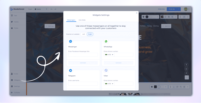
Want social integration for potential diners’ easier reach? Head to the widgets menu and choose an icon for any of your social media accounts.

Here’s a quick recap of how Renderforest’s simple drag-and-drop editor helps you build robust websites.
It’s time to show you some cherry-picked restaurant website templates for any taste and style!

We’re starting with one of the most vibey food website templates from our collection. Cafe Central immerses you in the golden evening atmosphere of a traditional urban cafe.
Relaxedly styled menu blocks, vivid background images, and darker hues create this template’s modern, attractive, and tactile appeal.
Most images and the overall color palette is in dark tones to position your restaurant as an evening destination. Thanks to this trick, Cafe Central is also one of our best bar website templates transferring all the vibes of the nightlife.
The dominance of dark green color aims to create a sense of tranquility and freshness. This kind of visual association might be especially important for those who serve organic food and want to emphasize their commitment to nature-friendly values.

Why not position your cafe from a fresh perspective? Put on a creative lens to look at your venue with Food Photographer Portfolio Template.
A clean, monotonous black background won’t distract from the focus points – your delicious meals and drinks. Upload any appetite-whetting images in the slider and make them instantly grasp viewers’ attention.
A pleasing color scheme of black, white, and beige shades adds some coziness to the page’s minimalistic vibe. The subtle page transitions are a nice touch that adds depth to this food blog template.
Though initially not included on our cafe website templates, this design can be turned into a digital menu or menu card with slight customization of sections. That’s a clean canvas to present the juicy details of your cuisine.
Getting hungry? Let’s move on to the next pizza website template!

Pizza? Who said pizza?
That’s the feeling that Cosy Atmospheric Restaurant Website Template will evoke in your would-be customers.
Equipped with only the necessary sections like Home, Menu, Team, Booking, and some social icons, that’s one of our go-to restaurant website templates whenever customers ask for something minimal yet eye-catching.
The color palette is rich, with dark red and white and golden accents dominating the design. That’s the combination that works for many food delivery website templates, thanks to the trust-evoking associations with tasty treats.
There is a separate menu page you can head to from the home page. Designed with all the menu elements like ingredients, price, and availability, you’ll easily turn this page into a menu board as well.
That’s also a great delivery service website template if you want a neat and clear presentation of the offered dishes.

Okay, it’s enough with all dark-colored restaurant website templates. We want something fresh, bright and summery now!
Food Delivery Website is one of the brightest cooking website templates on our list. Filled with every fresh and tropical color you can imagine, this template with plain white background is great for vegan diners, lunch cafes, and food delivery services.
Thanks to fresh vegetables and healthy food illustrations scattered around the homepage, this template is especially good for those sensitive to healthy cuisine or dietary restrictions.
The white background provides a good basis for vivid colors and gives a neat look to this delivery website template. You can switch any of the visuals to your own, but when you’re in need of instant change without much customizing, the Food Delivery Website is the way to go!

Those on a diet, please, look away because the Gourmet Pastry Shop Premade Website Template is for those who want to indulge in some delicious treats!
Cupcakes, cookies, muffins, and doughnuts- all these delicious items from your bakery can be featured on one of the best catering website templates.
There is an abundance of pale green text elements on the white background filled with many yummy visuals. If you’re making donuts or bread, you may leave some visuals unchanged, as they look very close to real.
This template is also one of our food ordering website templates, as it’s proven to have a hypnotizing effect on hungry browsers, who will instantly book their order or head to the nearest store.
The emphasis here is on images with only three key sections initially included on the home page – products, gallery, and order. It should be yours if you’re looking for a concise presentation of your sweet treats.

Another one of our beloved bar website templates, Specialized Beverage Store, is a static defile of cocktails, liquors, and hot drinks. You know that feeling when you want to grasp the glass and taste the drink right after you look at it? That’s what Specialized Beverage Store is about.
If you customize images, it can also become one of our coffee website templates, as it’s very suitable for any drink-based business.
As the design is very minimalistic, you can set any mood for this website by uploading your own images. It doesn’t dictate a particular style or cuisine, so it’s a blank canvas for you to express yourself.
This is one of the richest restaurant website templates in our gallery in terms of default sections. About Us, Our Drinks, Testimonials, Order, and Visit Us are here, but you can always add more or remove some of them.
This template is also unique, with its map section at the bottom. Great to show you a nearby café or bar people can visit to get some drinks.
Chef website templates have a special challenge that product or service websites don’t – they need to sell the atmosphere and encourage customers to taste the dishes.
Playing with the appetite of potential customers through visuals and copy is a tricky job. That’s a special science of combining the right colors (associated with freshness and tastiness) with really impressive dish and drink photos.
When customizing restaurant website templates, you should strictly avoid the common mistakes of overusing visuals or randomizing the color palette. It’s also a bad idea to leave out copywriting and focus solely on images, as they don’t tell much about what you actually offer.
The right way is to choose or make some mouth-watering visuals that will attract attention and confirm initial expectations.
Here are more tips to customize restaurant website templates.
The best colors for your food website templates are not the ones that go well with your branding. It’s more about the food category you offer or associated feelings.
Certain color combinations make people think about healthy and fresh ingredients, while others are a perfect match for restaurants that offer more luxurious food.
There are color pallets that associate with urgency that can be perfect for fast food delivery website templates. There are also those with clear associations with homemade, organic, and healthy food you should include in any vegan diner template.
So, our advice is always to consider color coding and certain palette associations when customizing restaurant website templates.
If you’re a novice in color selection, choose one of Renderforest’s suggested color palettes. Not a random combination of shadows that look nice together but a psychologically proven palette created especially for food websites, Renderforest’s color combinations are perfect for any type of restaurant website template.

Your restaurant website templates are tasked with creating memorabilia. So, any branding element (with no fanatism) is welcomed.
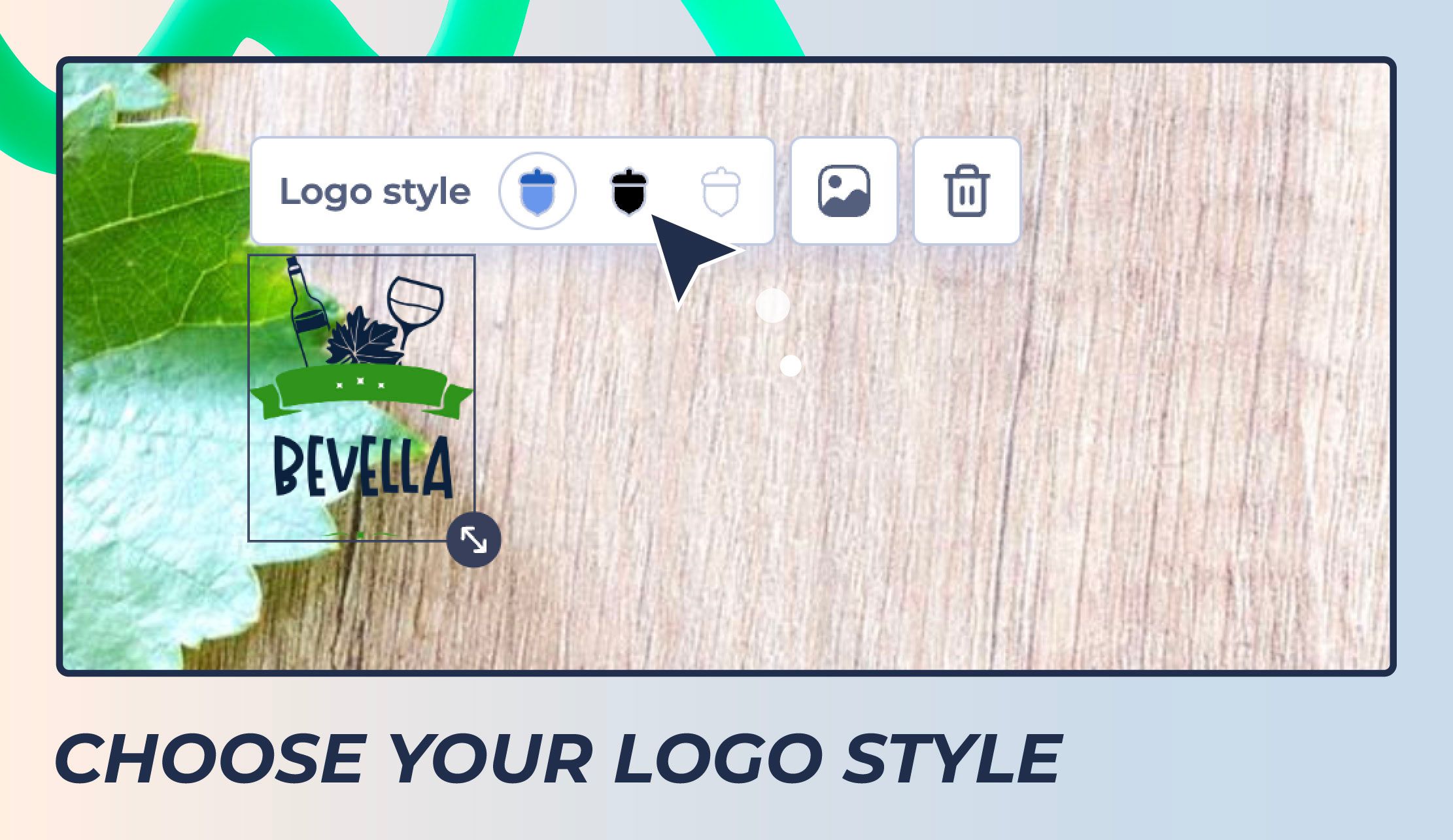
Take the time to incorporate unique elements such as logos, mascots, and characters that will make your restaurant website template unique among many other templates out there.
Logos are especially powerful when it comes to memorability. Plus, it’s a great way to tie together all the visual elements of your website.
You can also fill in your restaurant website with meaningful quotes, memorable sayings about food, or even funny one-liners. Anything that will be later seen by visitors in your physical locations should also be included in your website template.
When seeing the same elements on a website and in a restaurant, people will better connect them together, forming a strong brand association in the process.

When it comes to restaurant website templates, local SEO is dominating as the business specifics impliy nearby customers.
So, you need to optimize your template for local searches first. This includes writing titles and descriptions with the best keywords for your business category and geographical area.
For restaurant websites, it’s also crucial to have reviews and feedback from visitors, as stats show 60% of diners use online reviews to decide if they should visit a cafe or not. Encouraging customer reviews with some on-site tactics like special offers or discounts for customers will help you rank better.
Also, ensure all the information (like opening hours, location, menu prices and others) is regularly updated. Outdated data is your worst enemy if you’re looking to attract customers, as it usually signals to potential visitors that your restaurant is either closed or not so popular.
Lastly, content localization is essential, and not only for SEO. Localizing your content will make it more attractive to customers from different countries and cultures, so they will know what food you serve and how to order it.
Content localization refers to translating content into different languages, and adjusting wording and expressions to fit the target audience better while maintaining your native communication style.
Such content creates atmospheric, unique experiences that attract tourists’ attention.
Recommended Reading
Lastly, never forget about mobile optimization of your restaurant website templates. Over 80% of diners search for restaurants on their smartphone, and it’s no surprise most prefer mobile-friendly websites.
All the hungry visitors on your website expect the same experience as if they were using a laptop or desktop. They are driving after work, wandering in the city with family or friends in search of a really good place to eat.
Do them a favor – provide them with quick load times, easy navigation, and simplified checkout processes on mobile, so they can make a decision faster and head right to your restaurant with no further consideration.
Here are some quick tips that are universal for any restaurant website template’s mobile experience.
In Renderforest, you can switch between desktop, mobile, and tablet versions of the website to instantly see how the template looks. And when you switch between devices, you can notice certain elements are left out or not displayed on small screens. While you have to compromise some information for mobile users, ensure that it’s not critical, like your restaurant’s address, opening hours, reservation, etc.

Compressing the size of pictures or videos is essential to creating a fast restaurant website template on mobile devices. Especially with content-heavy websites, where you have to present large libraries of dishes and drinks, optimizing images for mobile is important.
Plus, many restaurants use background videos or pictures. While they look great on desktop, on mobile devices, you’d better replace them with fast-loading visuals without sacrificing the design quality.
Resize and compress your visual content and check page speed. Continue the process until you’re sure your website looks great and loads fast on mobile.
And yes, the menu – is the key factor driving potential customers to your restaurant or making them avoid it. You cannot ignore menu optimization for a restaurant website template.
The most successful menus are optimized for mobile devices, so put extra effort into creating an effective online version of your restaurant’s menu. Use plain and clear language that will motivate customers to pick something delicious immediately. Make sure the navigation is intuitive, with understandable and logical categories. Don’t forget to include pictures of your dishes for more visual appeal.
It’s also suggested to have big buttons for easy navigation and ordering. After all, the easier you make it for customers to find what they need, the better.
Your key goal is to ensure the menu can be easily viewed and ordered on mobile devices. When you succeed in this, visitors will enjoy their ordering experience and come back for more.
Restaurants are one of the most attractive content categories regarding website design. Who doesn’t like good food, tasty drinks, and the relaxing atmosphere of an old-fashioned cafe or a modern bistro?
So, your goal is to give some nice wrapping to what’s already attractive for visitors and ensure your website successfully navigates its way to the target audience – the one that loves your menu and style.
If you want to make a great restaurant website template, consider the points discussed above – pick an engaging design, create content optimized for local SEO, adjust visuals for mobile devices, and pay extra attention to creating an effective online menu.
And to save time and effort on manual coding, Renderforest’s restaurant website templates will come in handy. Pick the one you love, customize its content and design to reflect your restaurant’s identity, and get ready to welcome more customers through your digital door.
Article by: Renderforest Staff
Dive into our Forestblog of exclusive interviews, handy tutorials and interesting articles published every week!
Read all posts by Renderforest Staff

