
Case Studies

Colors shape our perception of the world. Our emotional response to color is so deeply rooted in the subconscious that we don’t even notice it most of the time. Brands take full advantage of this, trying to spark certain feelings and associations with their color choices.
It should come as no surprise that website color schemes are a key player in web design. The right color combination can smoothly tie all the design elements together, enhancing not only the aesthetics of the website but also the user experience.
In this article, you’ll discover what website color schemes are, why they’re important, and examples of gorgeous website color palettes. Let’s get started!
A website color scheme is the combination of all the colors and shades used throughout a website — be it the color of the background image, navigation menu, written content, or even smaller icons and buttons.
When you study some of the most impressive websites, you’ll notice that every single hue of the websites’ color palettes is carefully picked, and nothing is left to chance. Colors create associations, and associations matter more than you might think.
We already mentioned that a website color scheme plays a significant role in web design, but let’s explore more closely what that role entails.
It usually takes no longer than a few seconds for users to know whether or not they like a website. And as about 62-90% of their initial impression is dictated simply by colors, the importance of your website color scheme increases drastically.
As colors are closely linked to feelings, their smart usage is essential to setting the right mood for your website. By creating your preferred atmosphere, you automatically increase your influence over the emotional responses of your visitors.
Every website has primary and secondary colors. The former is used for headlines, important messages, CTAs, while the latter is reserved for subheadings, menu items, additional text, and so on. Why? Because the contrast of different-colored elements helps the right ones stand out.
It’s no coincidence that most sites choose red or other bold colors for their CTA buttons. The difference in color instantly gravitates the viewer’s attention to the right places. The use of primary and secondary colors helps the guests find what they are looking for much quicker, which noticeably enhances the site’s user experience.
A website is a brand’s online representation, meaning it has to be consistent with the brand’s identity. Just as your logo colors reflect your company’s character, so should the colors of your website.
Research shows that a signature color increases brand recognition by 80%. That’s quite an impressive number, so let’s see how it can be explained. Thanks to our strong color memory, we mostly remember brands by their dominant color. Think of Coca-Cola, for example — the bright red immediately pops up in our minds.
Using your brand colors consistently across your website will reinforce your brand’s visual image in your visitors’ memories. The more you show off your signature colors, the higher your brand’s chances of being remembered and recognized.
It’s time to tour through some of the most appealing website color palettes to see how brands have successfully employed colors to tell a story.
Apple’s website is a classic example of minimalism done right. The electric blue of the CTA buttons flashes against the darker seal brown, catching the visitor’s eye immediately. The website uses text sparingly, which keeps its overall look clean and ordered.
Here’s an example of a website template in a similar style. The minimal design supports and enhances all the right elements.


Mozilla’s website uses deep violet as the primary color and, together with lighter variations of purple, achieves a lively and modern appearance. But there’s another interesting detail — the brand playfully used its logo colors to add a finishing touch to the design.

Moz’s website combines several shades of blue with slightly desaturated yellow. The outcome is a calm, unimposing palette with nothing flashy or excessive. Yellow CTA buttons attract attention through contrast, while the sky blue color of Moz’s logo adorns the headings and important numbers.
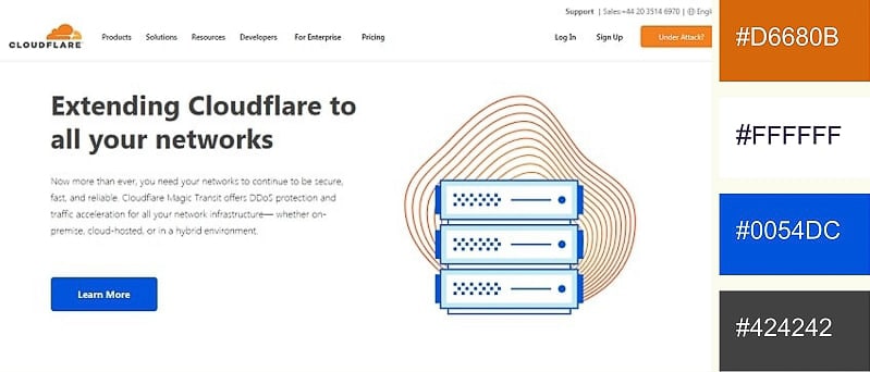
As a brand color, blue is associated with reliability and trust. Thus, it’s a natural choice for a company like Cloudflare, that’s all about security. Orange gives energy and dynamism to the design and is dominant in the brand’s logo. The two complementaries go very well together against a neutral white background.
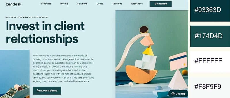
Zendesk employs several palettes on its website, but what’s consistent across all pages is the use of Nile blue. As the brand’s signature color, the blue beautifully aligns with its philosophy. The website pleasantly combines the Nile blue with pastels, achieving a soft and trendy look.
Explore
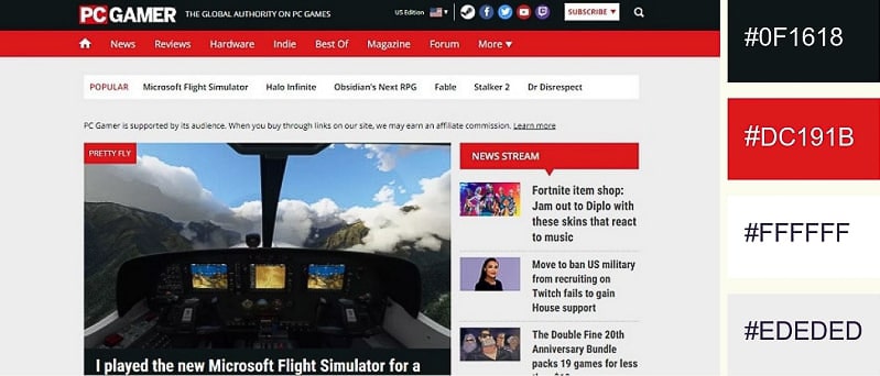
Red is one of the most commanding and zestful colors. It makes perfect sense that a website dedicated to the world of gaming would use it in its design. The other colors in the scheme (black, white, and grey) are neutral and provide a nice background for the color red to have its effect.
Here’s a similar website template that uses accent red to highlight important icons and CTA buttons.


Cherry red looks particularly appealing and feminine when contrasted with cooler hues. However, unlike soft shades of pink, it’s quite bold. This variation of red can thus be used to communicate a bold and empowering brand personality. As for white and grey, they give a light, airy feel to the design.
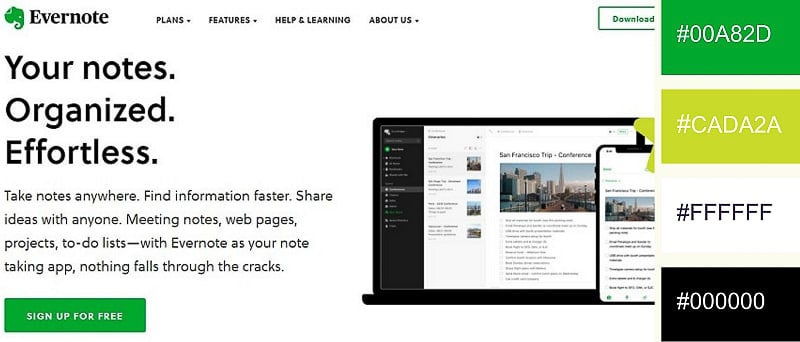
Evernote went for a minimalistic look that’s perfectly in line with its note-taking app. The ample white space allows the website to breathe, while green calms the mind. Notice how well this fits with the purpose of the app — to free one’s mind from clutter by organizing and consigning to the app all one needs to remember.

Pink is passion and playfulness — two characteristics that makeup brands tend to go after. Notice how the white plays an intermediary between the variations of pink, giving the website a flirty yet balanced look.
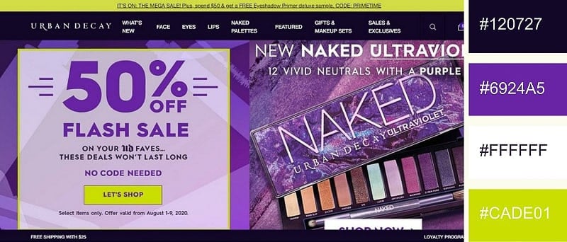
With a website as highly pigmented as its makeup, Urban Decay is a brand that doesn’t shy away from color. Varying shades of violet permeate the site and provide it with a rich and lively base. Notice how well the accent pear contrasts with the rest of the colors, commanding our gaze to follow it.
This music website template emanates the same energy through its heavy use of violet.

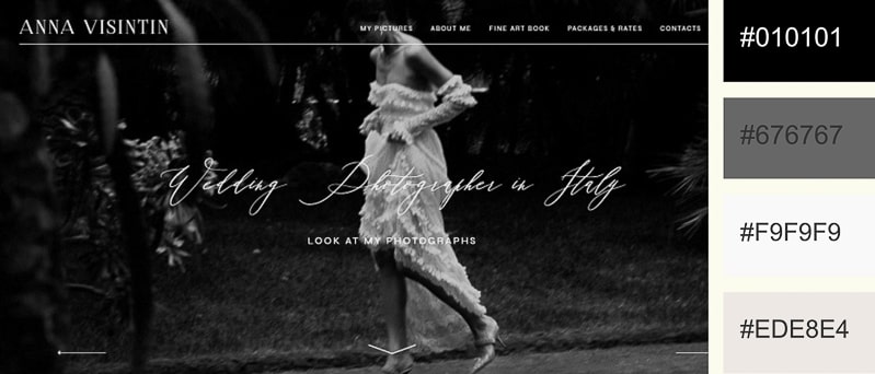
Anna Visintin’s wedding photography portfolio gracefully unifies all the shades of black, white, and grey. This reserved color palette, coupled with occasional blurry elements, achieves a dreamy ambiance for the website. Anna Visintin proves that you don’t need a vast array of colors to design a brilliant website.

This champagne-colored luxury owes its expensive look to the interplay of black, white, and gold. The smart combination of those three colors gives a high-end feel to the website, which is quite fitting for a luxury brand like Guerlain.

As a recruitment search firm, Lucas Group opted for a website on a more professional side. Pairing the calming blue with the neutral grey, the company positions itself as a trustworthy and competent business. Notice, again, how the color blue is implemented to symbolize reliability.
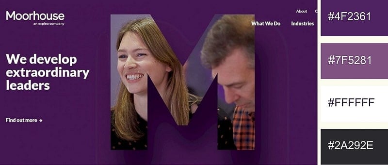
From the deep grape purple to its more modest undertones, this website’s color palette encompasses quite a few hues of the magical color. The varying layers of violet and a sense of depth to the site. The consulting firm’s choice of color is no accident, as purple is known to embody nobility, creativity, and wisdom.
Recommended Reading

Mercury grey and hot pink make for a very charming color combination. While the grey creates a neutral background, the accent pink brings life and vigor to the design. Pay attention to the visual consistency of Just Creative — the same colors are applied both to the logo and the website itself.
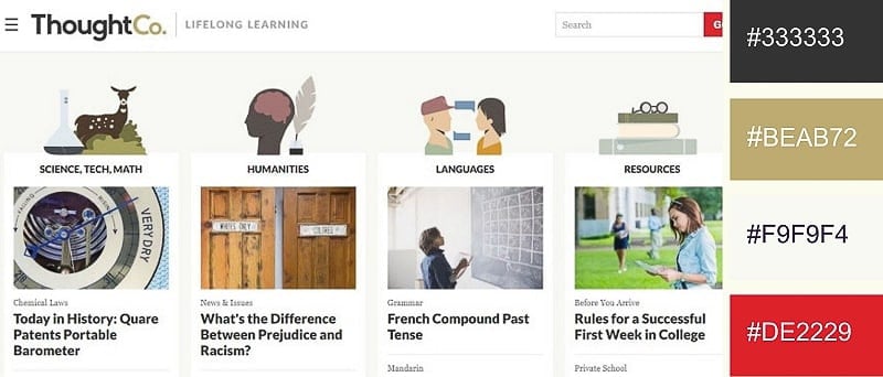
ThoughtCo employed several earthy tones to achieve a soothing, grounding atmosphere for its website. The minimal design free of clutter makes perfect sense for an educational platform like ThoughCo. Crimson can also occasionally be spotted as it highlights important messages and buttons. If you’re looking for a website with similar earthy shades, check out this template.

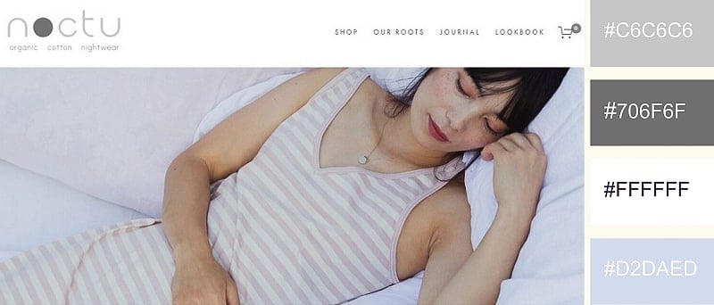
Through the right use of color, the cotton nightwear company found a way to make even its website look soft and cottony. All the different shades of silver and soft blue combine in a beautiful color palette to exude peace and serenity.
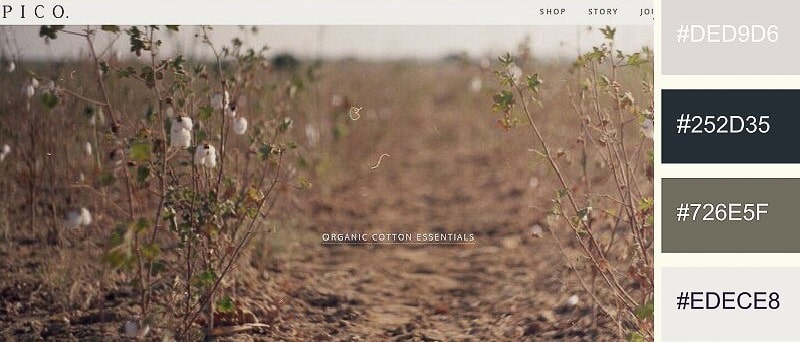
This natural and earthy color scheme goes incredibly well with the visual style and mission of the eco-conscious company. Instead of standard white, Pico chose Carrara beige for its background. The color is pleasing to the eye and is key to the light, feathery feel of the website.

Carrying the energy of enthusiasm and creativity, orange is a perfect match for this creative agency. The dusty grey of the background cools down the website and allows the accent colors to take center stage.
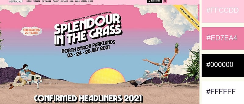
This warm color palette radiates so much heat you can almost feel it from the other side of the screen! The different hues of pink coupled with desert sand yellow produce a strong summery feel. Notice how the website uses colors to separate different sections.
Conclusion
The impact of website color schemes goes beyond appearance and aesthetics. Colors produce associations, triggering certain feelings in the audience. The exact meaning of colors may differ from culture to culture, but the persuasive effect they have on people is universal.
As your website is an extension of your brand, using your primary colors across your site will help to consolidate your brand image. This, in turn, leads to more brand recognition. Study successful examples, pick the color palettes that best capture your brand, and use them to share your message more efficiently.
Just getting started with your website? Check out our ready-to-use website templates that will help you build your site in minutes.
Article by: Renderforest Staff
Dive into our Forestblog of exclusive interviews, handy tutorials and interesting articles published every week!
Read all posts by Renderforest Staff
 Source: Apple